I want to commend everyone for their work on their typography assignments. It has been fun, thus far, to see the progress everyone is making in the web design. It was interesting to see everyones approach to their topic, how they incorporated their topic into their design, and the overall structure of the website. There is something about being able to instantly see the fruits of your labors that makes the process so satisfying…
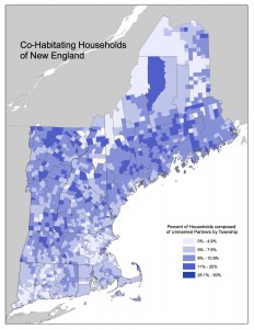
This weeks readings and assigned websites were mostly a refresher for me. In my cartographic design class we spent a week on color as it is one of the primary elements of a map. An important rule to remember in cartography is the colors you use convey the data. This is especially true when designing physical maps and some thematic maps: such as a choropleth, various isoline maps or sometimes proportional symbol. As a cartographer, it is paramount that you choose your colors carefully and with purpose. When developing a choropleth map, ColorBrewer2.org was a valuable asset in design. The website provides carious color schemes taking into account the type of data, number of classes, and even the various data that would overlay the colors (roads, labels, state boundaries etc.) An added struggle in cartography is the difference between additive and subtractive colors. I am glad this was discussed in the readings as it was a struggle for me in some of my undergraduate classes. Since all computer screens use additive colors (RGB) to produce the various hues and gradations of colors on a screen, the subtractive color process (CMYk) of printing became a challenge. The colors I would employ in designing my map on a screen were not always the colors that came out of the printer. I can remember developing a choropleth map from 2010 census data. I had chosen blue as the primary color to show the various percentages of unmarried households in New England. However, the map was to be printed and I must have printed it 6 or 7 times to try and get the printed blue to match the blue on my display. It can be a tricky process. (Map included below…)
Reading through both White Space is Not Your Enemy and The Non-Designers Design Book helped to remind me of the complexity of color. Everything from the hue, saturation, value to split complimentary colors, a lot of thought is required. Understanding the basics (what is covered in the two chapters we read) is important to maneuvering through the “color world”. Being able to understand primary, secondary, and tertiary colors as well as what the color wheel looks like is a great aid in the designing process. While as daunting as this may appear, the process of choosing your colors is fun and exciting. It is extremely satisfying when colors begin to “click” and you can see your palette form before you. As a cartographer, within ArcGIS (the mapping software I used in my undergraduate), I tended to use the HSV settings on the Color menu. In my opinion, it was easier to locate a color then relying on the RGB slider etc. However, currently, I do not have a color menu such as the one provided in ArcGIS. I appreciated that Dr. Petrik provided those two articles (here and here) as well as a link to the W3C Color Names page. I would like to have a program on my computer to develop and create color palettes.
As a word of advice from someone who has experience in design: don’t be afraid to change design decisions (such as color choices) down the road in your project. As your content comes together and you webpages come along, you may find that the colors you chose simply do not convey the message you want. Do not feel “stuck” with colors because you have been using them for a large portion of your design time. Just as in maps, colors are vitally important to convey data and an overall message to the reader, the colors on your site should create an atmosphere conducive to the historical experience recounted therein.
P.S. For your viewing pleasure: A Hex color clock
P.S.S. The Hex color values in the title for this post… they are the official colors for the Boston Red Sox.
