This week, I was introduced to Palladio and RAW as networking visualization software. Both programs are web based, accessed through your web browser, and do not offer standalone programs. There are pros and cons associated with web based programs. It can be a nuisance to have to upload data and always maintain an internet connection, “running” the program does rely on my computer hardware to process the data. Both of the programs offer an interesting array of options of visualizing the data. Not only are the networks pretty, they provide a visual that can really help the user come to a better understanding of the data. Below is my discussion of each program (with pictures) followed by my thoughts in general.
Palladio
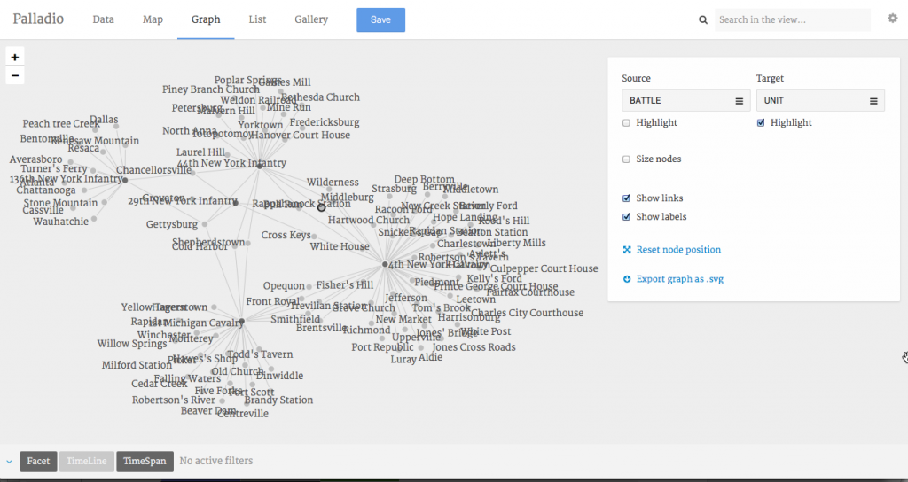
Palladio is a Beta Program coming out of the Humanities and Design lab at Stanford University. The user is able to upload data (in particular formats) and then view that data in a variety of ways. This week, I was most interested in using the Graph view which provides a network using nodes (the items) and lines (sometimes referred to as edges) to illustrate the connected network. The graph can be manipulated by highlighing nodes, sizing the nodes, and removing lines and or labels. While the user can click on a node and drag it across the screen, making the rest of the graph to shutter and move, this function does not add much by way of analysis. Below is my graph of the sample data provided by Dr. Robertson (five different Civil War military units and the battles they were involved with.)
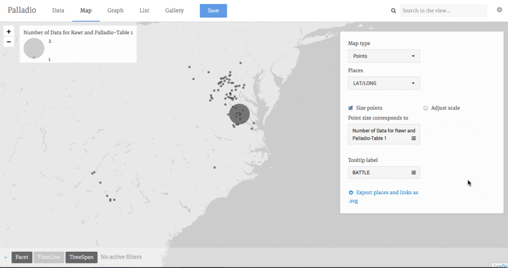
Thanks to Alyssa Fahringer‘s work of identifying the latitude and longitude of most of the battles, I was able to map the data on the Map view tab. What is produced is a map of dots for each geographic location. You can choose how to label these points (battle name or military unit.) You can also create whats called a Proportional Symbol map. Essentially this means that the symbol increases in size as the quantity for that item increases. Using our current data set, each battle has at least one of our five units present. As the number of units present increases, the symbol for that battle increases in size.This is a great way to visualize the geographic relationships of data.
However, Alyssa and I compared our proportional symbol maps and we found that they were different. While we had used the same data, we uploaded the data differently. I had transcribed the latitude and longitude into one CSV file. Alyssa uploaded the list of battle names and military units and then, using an option provided by Palladio under the Extension option, added a new table of the Battle name and latitude and longitude coordinates. We could not confirm that these two methods provided for the discrepancies in our maps. Either way, both of our maps were incorrect. My map (included below) shows that all but one of the battles only had one of the military units present. This simply is not true. Various battles such as Gettysburg, Chancellorsville, Bull Run, etc. had multiple units, from our sample, present. Alyssa’s map showed that each battle had a minimum of two units present which also is not true. When I looked at my data under the Data view page, it shows multiple battles had multiple units present. Why this is not being translated onto the map is beyond me…
RAW
RAW is a program developed by DensityDesign Lab and provides the user with 16 pre-loaded network visualizations. It even allow the user to upload their own charts as well. Uploading data is straight forward (very similar to Palladio.) I included a couple of different network charts below.
Alluvial Diagram
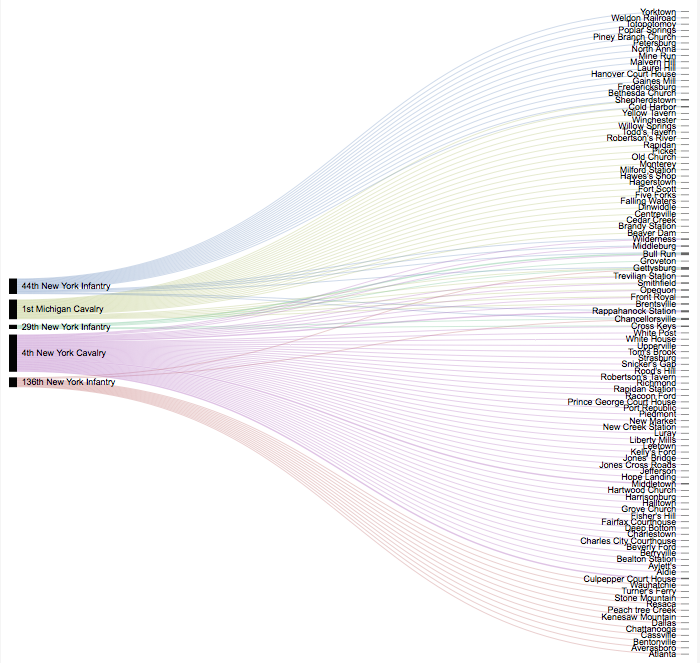
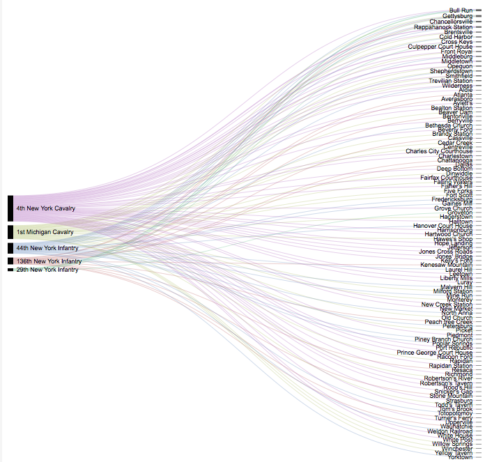
One of my personal favorites is the Alluvial Diagram. It is very fun to look at and illustrates relationships very nicely. However, I noticed that changing the ordering of the variables on the left really affects the “look” of the network. The first image below shows the units organized automatically by the program. I am not sure how the program organizes the data but it would appear that the battles are reorganized on the right to create the cleanest looking network. The second image is ordering the units by size. This puts the 4th New York Calvary at the top followed by the 1st Michigan Calvary. However, this creates a complex looking relationship with the battles. In my opinion, this could give a false sense of the overall relationships between these variables. This is why it is important to organize the data in various ways to gain a full appreciation for the relationships that exist.
Reingold Tilfold Tree
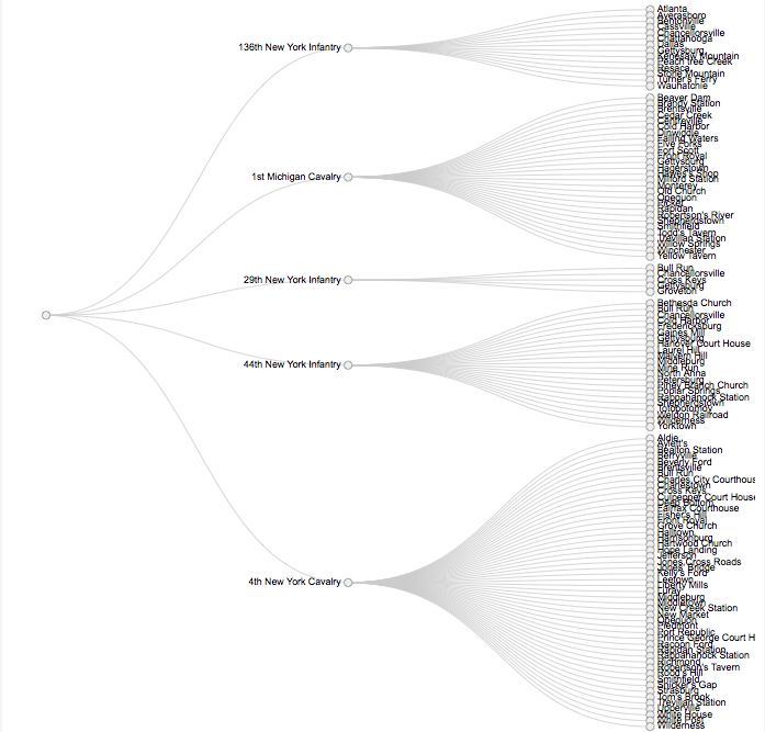
The Reingold Tilfold Tree is an interesting way to investigate the sheer number of battles that each unit took part it. It is almost like a list of battles for each unit, with battles being repeated for different units (i.e. Bull Run for the 1st Michigan Calvary, 29th New York Infantry, 44th New York Infantry and the 4th New York Calvary.)
Circular Dendogram
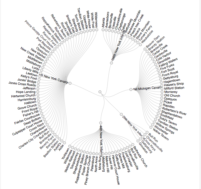
This last one, the Circular Dendgroam, is almost like the previous network in circular form. My impression is that with a more complex data set, these visualizations would prove to be more useful and even more interesting.
All of these visualizations both reveal and conceal information. These visualizations show the user, very quickly and effectively, what battles each military unit was present at. It highlights the battles that multiple units were at as well. However, no other information is being provided. Did the units interact with each other at these battles? What constitutes “being present” at a battle? Were the units present for the entirety or the battle or just the last day, first day, etc.? How involved in the battle was each unit? Were they towards the rear, in the front, providing support etc.? It is important for a historian or the user to understand that the visualization answers questions and prompts many more.
In comparison with last weeks discussion, how different are these networks from text mining? The biggest difference is the presentation of the analysis. Networks are using the inherent function of the digital medium when it presents the analysis, namely it is visual. Text mining can use aspects of the visual with word clouds but overall, text mining provides counts and numbers. Networks also illustrate various relationships. For example, a network can be created for communications (letters etc.), for topics, for contents of texts, for organizations etc. Networks are then able to be adapted for the more concrete relationships to the more abstract. Text mining dwells mainly in the concrete while topic modeling deals more with the abstract. While this is a weak analysis of the two methods, as my experience with each increases, so will my understanding of how they are similar and distinct.
