Clio Wired 1: An Introduction to History and New Media is the first in a series of courses focused on the Digital Humanities. George Mason History PhD students are required to take the first two courses in the Clio Wired Series. Clio Wired 1 introduces the students to the state of the field and the changing nature of historical scholarship. I took Clio Wired 1 in the fall of 2014 from Dr. Stephen Robertson. During the course, we discussed the various methodologies employed in the digital humanities including, but not limited to text analysis, networks, mapping, crowdsourcing, and digitization. Other such topics as copyright, public history, digital scholarship, and digital pedagogy were also discussed. Dr. Robertson’s syllabus is available online.
Final Project
The final project for the class had to incorporate one of the methodologies discussed in the course within your own field of research. I chose to use text analysis, more specifically text-mining, on a corpus of American Revolutionary Era sermons. In presenting my work, I chose to experiment with web writing by organizing my research on multiple webpages rather than writing a single monograph.
Blog
During the course, each student maintained a blog where they reflected on each week’s readings as well as various practicum assignments. I have included my blog posts from Clio Wired 1 below.
Digital Pedagogy
Teaching digital history is the perfect topic to end the class on. After having completed 12 weeks of this course, I have both experience and the readings to "pull" from when considering this topic. Digital literacy and digital fluency are extremely important if the field of history is to continue and grow. One of the questions asked in a session at the RRCHNM 2oth Anniversary conference was "Is Digital History inevitable?" Someone could easily argue both sides of this question but one of the contributors in the session redirected the focus to, arguably, a more important topic. He said "Digital History is not inevitable. Digital sources are." With the ever growing corpus of digital sources, digital teaching/pedagogy is quickly becoming a major focal point.
Danah Boyd's Are today's youth digital natives chapter was particularly interesting to me. Growing up with the digital age was a "fish in the water" experience. Trying to explain to a fish what water is proves to be very difficult as its entire world is water and it knows nothing else. It would be near impossible for the fish to grasp the concept of water and thus come to appreciate it more. For myself, I never fully noticed that I grew up with the digital age. It wasn't until recently that I snapped out of this "trance" and recognized what I had experienced. To project onto Boyd's argument, today's youth do not inherently have this appreciation and aptitude for the digital. While they are immersed in it, the digital literacy, fluency and skills are acquired through work not inherited through generational cohort. Recently, in a session the at RRCHNM 20th Anniversary Conference, it was discussed the lack of understanding undergraduates have of certain digital resources such as JSTOR. It was mentioned that certain students thought JSTOR was a journal. One of the contributor's of the session responded with "JSTOR is no more an academic journal than your grocery store is a farm." In comparison with Boyd's research on the near reverence shown for Google and it's search results, some other DHers and I tried to find a similar analogy to explain what the search results are. Though not perfect we arrived at "Google is like an advice columnist who is both paid by companies and influenced by lobbyists." The assumption that individuals born into a specific day and age, are inherently adept at digital practices is neither fair for that individual or those who come to rely upon them.
Furthermore, in the teaching of digital history, Dan Cohen's closing remarks in his article Pragmatic as Well as Prescient: Digital History Education at George Mason University were particularly poignant. In referencing a blog post by Tom Scheinfelt, he writes "digital history (and the digital humanities more broadly) requires more attention to methodology than theory. This might be an uncomfortable fact, since for most of the past 50 years our discipline has focused on—and rewarded—theoretical advancements rather than practical ones." This has been a reoccurring topic in both class and in my own discussions. There needs to be a shift away from the totally theory focused historical training and scholarship to one that gives reverence to the method and medium. In Allison Marsh's Omeka in the Classroom: The challenges of teaching material culture in a digital world articulated that even the graduate students have come to expect the traditional. When she introduced her students to the digital she writes that "when it comes to coursework they expect, and sometimes demand, a traditional graduate seminar where we read and discuss books. More than one student has balked at my assignments, whining, ‘I don’t need to learn how to program. I just want to be a regular historian.’ " We, as historians, need to come to value the method and medium. And in order for that to take place, we need to embrace the varying methods of analysis and research. In order to bring about this change, I think it has to start in primary education to some degree. When incoming scholars are raised with digital awareness and literacy, the field of history would change much more quickly.
Mills Kelly's Chapter 5: Making: DIY History? from his book Teaching History in the Digital Age highlights his Lying about the Past class. As awesome and fun a class as this would be, it would be just as informative and didactic. Even Mills noticed that the two class sections he taught of this class were the most prepared, thought the most critically, and engaged the material in all the years he has taught. The students learned valuable lessons about ethics and history as well as greatly increased their digital literacy. I am sure the ethics of the class in general have been and can be debated, but it left an indelible imprint on each of the students. This type of engagement with the digital is what the youth (and for that matter adults) need in order to increase their digital awareness and skills.
Scholarly Access
In the overall pursuit of truth and knowledge, what is the most important step? This is not an easy question to answer. It prompts all sorts of responses from the initial steps of developing a question to the recording of the answer. In some ways the answer to this conundrum changes according to circumstances and time. It is my position that the dissemination of knowledge takes center stage as the most important step in the pursuit of truth and knowledge. Is not this the purpose to discovering truth? To pass that information on for others to incorporate and build upon. Yet throughout history, this has not been an easy task. Centuries ago, Socrates was sentenced to death for his "corruption" of the youth. William Tyndale was strangled at the stake and then burned for printing an Bible in the common vernacular (English). These two examples are extreme, especially in todays society where issues over intellectual property and copyright result in lawsuits and not heresy. However, the extensive amount of laws that encompass copyright are a force to be reckoned with. As a young scholar, the span from OA (Open Access) to Fair Use to Copyright Protected is a long and complicated walk.
Dan Cohen's and Roy Rosenzweig's Chapter on Owning the Past provided a fairly detailed background on the progression of Copyright (though it is slightly dated, being published in 2006). They give a general overview of the development of copyright and then discuss the ways that you can protect yourself and your work. It can easily overwhelm the reader, as it did with me, with the various copyright extensions and exceptions. One of the underlying themes of their chapter was the adoption of copyright as a protection mainly for the authors and not for the public. My limited exposure to copyright encompasses the big Napster debacle (that was 15 years ago?) and my brief tenure in the Education division of CHNM (details found here). In both cases, the impression was that copyright was working against me as a consumer/member of the public. Dan and Roy describe Article 1, Section 8 of the Constitution as a balancing of the "public good and private reward." Viewing copyright as a positive, from the public's perspective, is both a difficult and illuminating exercise. It prompts further research and introspection.
A statement issued in 2013 by the American Historical Association created quite the firestorm around the topic of accessibility. The AHA supported the allowance of students to embargo the digital rendering of their completed history PhD dissertation or thesis for up to six years. For their reasoning, please follow the hyperlink above. Their statement prompted a lot of feedback both supporting and critical. Various articles and blog posts were written that prompted further discussion in the comments sections. Reading through all of these voices, I was left to ponder my inexperience in the field. Holding a bachelors in Geography, no advanced degree in History and only in my first semester of my PhD program, I felt that there were a lot of experiences that I lacked that would inform my opinion on this issue. In spite of my "youth," I came away from the AHA statement in support of it. I support the framework that allows the student to decide how to handle their scholarly work. For those who do seek to develop their dissertation into a book length monograph, the public and free access to their dissertation could prove to be damaging to that pursuit. Yet, I am forming this opinion on "fuzzy" facts. The survey that is referenced both by William Cronon in his article Why Put at Risk the Publishing Options of our Most Vulnerable Colleagues? and in Adam Crumble's blog post Students should be empowered, not bullied into Open Access can be used to support both sides of the discussion. The data left me wanting...well, more data. However, I feel that the debate surrounding the AHA statement runs deeper than the potential embargo of dissertations.
In talking with a fellow digital historian, multiple issues come to the surface. The first, one that Trevor Owens touches on in his blog post Notes toward a Bizarro World AHA Dissertation Open Access Statement, is the antiquated reliance on the monograph as the lynchpin for job placement, promotion, and tenure. As Digital History continues to grow and permeate the discipline, little credibility has been given to the work that many DHers produce. Furthermore, their work does not carry nearly the same clout in the profession of history as monographs do. This statement from the AHA, in a subtle way, continues to enforce that practice and perception. Also, it was mentioned by various commenters that the AHA is a normative entity. This is to say that while they do no make the rules for promotion and job placement, they wield a lot of power in the field. They have a "what they say, goes" type of influence in the profession. The AHA could have taken this opportunity to endorse and promote the use of Digital History scholarship as equally important to the monograph in job placement and promotion.
In conclusion, the phrase "turns like a battleship" is left in my mind. Five years, for a digital historian, is a long time. The technology is changing and the medium is growing. This is why, when you read an article about digital history, the reader should pay attention to the year it was published as that will dictate their reaction to the article. However, five years for a traditional historian is still journalism. It is hard to think of a history class devoted to 2009 or even 2005. In this way, the field of history "turns like a battleship." It is slow, cumbersome and frustrating. We, as digital historians, should do all we can to speed up the process. The important thing is that the field IS turning.
Digital Scholarship Explored
This weeks reading shifted the focus of the class to one of the major facets of Digital History. Previously we have explored the hardware that goes into the digital medium, various tools used in Digital History, and how it has been used with different audiences. The readings for this week, on Digital Scholarship, moves our focus and discussion to a new arena. This weeks reading really helped me to understand digital scholarship, whether it be in blogging, online journals, etc. and its position in the field of history.
One of the major themes across the readings was the structure of the field of history around the book. Tim Hitchcock's article Academic Writing and its Disconnects, he articulates that "in the process of moving beyond the book, we have also abandoned the whole post-enlightenment infrastructure of libraries and card catalogues (or even OPACS), of concordances, and indexes, and tables of contents. They are all built around the book." It will be and is difficult to try and change the field in what many would consider a dramatic way. The book has been the focal point of the history field for centuries. William Thomas' essay, Writing a Digital History Journal Article from Scratch: An Account, recounts his experience writing a digitally born article for AHR illustrates just what reactions people have. While he and Edward Ayers, his co-author, adjusted to the feedback, ultimately he writes "Another lesson we learned was that readers will need to adapt. So will historians. We have deeply cherished relationships with reading history..." This topic has really caused me to slow down and think about this shift. It is an important shift in the field and one that each of us, whether Digital Historian or not, to contemplate. My introspection is on a personal level, "How am I going to adjust to this as a historian?" and then even broader "On what part of the spectrum will my scholarship reside? Part of the transition? Part of the push-back? Will it 'plead' ignorance to this transition?" While I am a digital historian, as I have mentioned in previous posts, I am still a traditionalist as well. This dichotomy plays within me as I continue to engage my coursework. Ultimately, time is on everyone's side, I think. As Hitchcock mentions, this is not happening instantly or even over night. The transition is slower than that. Books and manuscripts still exist and will continue to exist into the foreseeable future. Those who support the transition have time to create frameworks and establish precedence and those who fear it have time to come to terms.
My favorite article out of all the readings was Melissa Terras' The Impact of Social Media on the Dissemination of Research: Results of an Experiment. Ultimately the article was a polished compilation of three blog posts she made on her use of Twitter and the Blogosphere to increase awareness of her open-access research papers. It was amazing to read through the results as she sent out "alerts" into the social networks. As a social media skeptic, her use of and the results from this experiment illustrate the true power of social media. This also articulates the importance of an online presence. Terras mentions that she had already built up a following on social media. Before she sent out her first tweet about her open access articles, she already had over 2,000 twitter followers. Maintaining an online presence leads to an increase in the publicity and ultimately, use of her work. I have a stronger commitment to maintain an online presence continually through such technologies as blogs, Twitter, and even Facebook. On a somewhat related note, this is a great endorsement as well of open access scholarship. Her article becomes a great segue into the final topic I took away from the readings, digital scholarship and academic standings.
The final reading assignment was A Call to Redefine Historical Scholarship in the Digital Turn by Alex Galarza, Jason Heppler, and Douglas Seefeldt. It served as a call to the AHA for action. Specifically, it was "a collaboratively-written call for the American Historical Association to appoint a task force to survey the profession as to the place of digital historical scholarship in promotion and tenure and graduate student training and to recommend standards and guidelines for the profession to follow. " I whole-heartedly support this call. What I like about it, is that it wasn't demanding a change in light of digital scholarship but instead an investigation into its place in the field. Online presence and online scholarship are becoming important parts of scholars existence. I would hope that the influence Melissa Terras has through her blogging would be part of the consideration for employment, advancement, etc. It is, in one way, a quantifiable method to identifying her sphere of influence beyond classrooms. Now, in an attempt to not sound like a "bandwagon" fan of digital history, I would like to do more research on the implications of such a consideration and re-adjustment of the profession. I was intrigued by the comment that blogs can be seen the same as lectures in the field. This topic warrants further investigation on my part but I think it will be a key topic of discussion for years to come.
Gaming History
Growing up, I played my fair share of video games. As a matter of fact, my parents still have a tote full of my old consoles and video games from my childhood. Up until this week's reading, including my childhood, I never thought of those games teaching history. Sure, you may learn some simple facts about westward expansion from Oregon Trail and I did learn what a Janissary is from Age of Empires but that was the extent of it for me. This week's readings provided interesting arguments and perspectives on the use of gaming in history teaching.
The first article, Joshua Brown's "From the Illustrated Newspaper to Cyberspace: Visual Technologies and Interaction in the Nineteenth and Twenty-first Centuries", starts off with a great quote and discussion. He quotes Johan Hulzinga when he wrote "Historical understanding is like a vision, or rather like an evocation of images." Brown then added that history really is a series of images yet the teaching of history remains textually based. I kept coming back to this statement throughout the rest of the readings. This argument works well for Digital History as a whole. One of the first things Dr. Robertson has told us is that the Digital is inherently visual. It is this important aspect that makes digital history such a diverse field. Even further, gaming is literally an infinite series of images that the end user interacts with. In this way, proponents of "Serious gaming" claim that it can articulate history in a richer format. While I can understand their position, I find myself more of a traditionalist. There is push back, in my mind, to the use of gaming.
I really liked Adam Chapman's article "Privileging Form Over Content: Analysing Historical Videogames" as he articulated an important point when it comes to judging the didactic nature of video games. Chapman breaks down a medium into two parts, the content and the form. The content is what the medium is stating about history. That is fairly straight forward. The other part, the part that he says more attention should be given, is the form. The form of the medium is how it goes about providing the content to the end user. Chapman articulates that the majority of the critiques of historical didactic video games are of content. He makes a fantastic point when he states "Analysis on the basis of content alone almost invariably involves comparisons with historical narratives constructed and received in book form, which is often problematically understood as the only form capable of producing 'proper' history." This highlights a major flaw in the critiquing process, myself included. Because the majority of history that I have learned has come from books (and some films), when I critique these games or the concept of gaming in general, it is against this traditional book monograph that gaming is compared. It is a fundamental flaw in my process. This is true in the field of Digital History in general. The use of maps, as I saw a few weeks ago in class, had people critiquing the maps because the argument and facts were not readily present. They compared it to their monograph reading experience but in turn did not devote as much time to interpreting or "reading" the map as they did the text. Perhaps this is my flaw? Maybe I need to spend more time engaged in these game to have a stronger base on which to form my opinion.
The final thought I have, comes from Trevor Owens piece "Games as Historical Scholarship." This is a short article but in it Owen highlights a shortcoming with text. He states "The linearity of text helps make the past seem far more tidy than it actually was." I personally feel that this is an important principle and one that students and scholars of history must always keep in the back of their mind. Serious gaming can bring this complexity to light that books and other static mediums are not equipped to do. The follow up question I have then is "Are the games a stand alone project or would they be used as supplemental to text etc.?" I am more comfortable with using games as an additive to other forms of history teaching than by themselves. This is possibly a bias on my own part that could be mitigated by more immersion in the gaming medium. If so, I am interested to see others reactions to the readings.
Sourcing the Crowd(s)
Growing up a Latter-day Saint, I had the opportunity to be involved with the Church's genealogical efforts. An integral part of genealogy is having indexed records for the end users of the primary documents. An indexed record is much easier to use as it provides machine readable text that can be searched. Anyone who has tried to use a census or birth certificate that was not indexed can attest to the blessings of indexed records. The LDS church goes about indexing records by crowd sourcing the work. They developed a standalone software that downloads "batches" of records that the indexer then transcribes and uploads to the Church. I have indexed various records and at one point, the Church had put out an app that allowed you to transcribe a document a piece at a time. In essence, the indexer could download the document to their mobile device and work on it periodically throughout the week. My brother, who has a private family therapy practice, would spend a couple minutes working a document as he waited for his next appointment. By way of accuracy, the LDS church would have multiple people index the same document. If discrepancies arose, an arbitrator would be assigned (usually someone who has been trained) to mitigate the differences. The whole process of crowd sourcing for the LDS church has worked well and their is continued emphasis placed on the need for more indexers. My experience with indexing provided a framework of interest with Crowd sourcing.
I found both the articles on Wikipedia (Roy Rosenzweig's Can History be Open Source? Wikipedia and the Future of the Past and Leslie Madsen-Brooks' article Engendering Online History: Wikipedia vs. Ancestry.com) very interesting. I had always been taught, especially in high school and in college, that Wikipedia is not a reliable source. Now Roy Rosenzweig does a comparative study to find that Wikipedia is not as inaccurate on facts as it is often made out to be. Roy's article is a bit dated, it being written in 2006 and I am left wondering if his figures would still be representative. Even still, I had been told not to cite Wikipedia in any scholarly writing. Thus I was surprised to find, when scanning footnotes in the last three years of publications in the Journal of Mormon History, to find a couple articles with Wikipedia citations. One article had upwards of five or six different Wikipedia citations. Is there a shift in the acceptance of Wikipedia and its crowd sourced history? If there has been a shift, I was not informed of it. I still feel that Wikipedia is in a sort of Limbo. It is not the ramblings of someone online as it declares an NPOV (neutral point of view) with its content yet it is not scholarly work since it puts the emphasis on the majority consensus and not scholarly research. IN addition, scholars do use Wikipedia, or specialty wiki pages, in academic settings. During my undergraduate, my GIS/Cartography professor was a huge proponent of wiki.gis.com. In each class I took from him, and I took several since I was a GIS major, he did not assign a textbook. Instead we would use the GIS wiki and other sources to cover that weeks materials. In addition, each week we were required to make a significant contribution to the GIS wiki. He laid out criteria for what constituted a significant contribution and each week we edited the wiki and then emailed him the page we edited. He then, with our username, could check the webpages history to see the changes we made. This was his way of improving the wiki and providing a free online resource int he field of GIS. It is interesting of note that my opinion of the GIS wiki is much higher than of Wikipedia in general. I am left to ask why such a disparity in opinions?
I really enjoyed Rebecca Onion's article Snapshots of History from Slate. She articulated some of the fears that I have with the use of social media, in her case Twitter,with the history discipline. I found it very sad that one of the accounts users did not care to try to include any attribution. As a historian and academic, that is very discouraging and depressing. Rebecca is able to articulate many different issues that these accounts create. As I read her article, I kept thinking of last weeks article Life on the outside: collections, contexts, and the wild, wild web by Tim Sherratt. Tim was able to show the impact of social history in a positive way, as it increased traffic to archives and museums but Rebecca Onion is able to show the "dark" side social media. I am left trying to parse out my opinion on crowd sourcing when i have such a negative opinion on social media's involvement in history. I am not entirely prepared to articulate my position but I do think that Trevor Owens post The Crowd and The Library articulates well that the terms crowd and sourcing are somewhat misleading. I like, instead, the idea of engaged enthusiast volunteers.
In total, I am left to ponder on this topic further. While I gained a better understanding of Wikipedia and Ancestry.com, I am not entirely sure where my opinion falls on their methodologies. We live in an age where the internet has brought about a globalization on a digital scale. Collaboration across continents can be easily realized and should be utilized. Crowd sourcing, then, is a powerful tool and wonderful opportunity. Yet the implementation and ethics are still being worked out.
Building an Omeka site
You can use the Tab labelled "Mormon History Test Site" or click here to go to my Omeka site.
Omeka is a content management system that was built with the focus on the "item" and not on text. Think of it as a way to collect, curate and exhibit digitized objects and documents. As a DH fellow at CHNM, I have heard a lot about Omeka as it was developed by the Public Projects division of the center. I was excited to get to use Omeka and learn more about this powerful tool. It just so happens that this weeks practicum for Clio Wired I is to install Omeka and upload some items. At the same time, the fellows rotated into the Public Projects division of the center and were assigned to become familiar with Omeka. For the practicum, we were asked to upload six items to Omeka and play around with them and write about our experience.
My first task was finding sources/items to upload to Omeka. In a way, I am behind the curve on sources as I came into the PhD program without a Masters degree and an undergraduate degree in Geography. I wanted to use this practicum as a trial run for my semester project. The idea for my project was to text mine sermons given by Jedediah M. Grant during the Mormon Reformation. I was then going to map the places Grant went to give these sermons and see if there was a correlation between where he was and the type of language he used in his sermons. He only lived for the first year of the Reformation, but in that time he received the nickname "Brigham's Sledgehammer." However, in my preliminary research I was only able to find the text for roughly five of his sermons and all but one of them was given in Salt Lake City. At any rate, I have put this idea on the back burner... I instead collected some political cartoons on Mormonism from the nineteenth and early twentieth centuries. I went to the Library of Congress online and searched through there Prints and Photographs collection.
One of the important parts of uploading items to Omeka is the metadata. Omeka uses the Dublin Core standard for metadata. I was unfamiliar with that system but Alyssa Fahringer showed me some documentation on Dublin core through the Omeka codex. It was helpful in understanding what each indicator was and how to ultimately use Dublin Core. Since the Library of Congress has fnatastic metadata on each of their items, it was relatively easy to fill in the information needed. Some of the fields I didn't use with any of my items (i.e. contributor). I imagine that certain items would warrant that field to be populated. Overall, my impression of uploading the items and populating the metadata is positive as the documentation helped the process.
After I uploaded all my items, I created a collection. I chose to focus the collection on cartoons whose focus was on polygamy. This included four of the six items I had uploaded. I found the process of creating a collection very easy. You work your way through the metadata fields, populating them with the relevant information. Since I had already uploaded my items, I went back and edited each one to add them to this collection. It was a very straight forward process that is easy to manage.
The appearance of the site is important to me. I didn't like the default theme as it didn't highlight the image of the item. My background in cartography really trained me to be a visual person. I wanted the image of the item to be the first thing the end user sees when exploring my Omeka site. I tried out various themes and found Seasons to organize and display the items in a way that I like. I do like that there are different themes that can be used on the site and that each theme is fairly different. I have used some sites where they offer different themes but they ultimately are the same layout just with different coloring. I also renamed the tabs across the top to not be so generic. I removed the exhibit tab as well since I do not have an exhibit up yet.
After I had finished designing and managing my site, I moved around on the website. It is very intuitive on both the back and front ends. That is to say that it is hard to "get lost" in the site. Granted this is only a test and my total number of items amounts to six even still, it is a great design. During the entire process, I did not run into any problems with the interface or software. Not once did i need to go to a FAQ page or Help me forum when using this software. I am excited to use this more and would like to work it into my semester project for class.
History in the Public Sphere
Coming into the PhD program at George Mason, my career goal was to land a tenure track professorship at some research university. My experience in my undergraduate courses with fantastic professors who showed excitement and devotion towards their field as well as passion toward their students inspired me to follow in their footsteps. In this way, I have spent little time exploring various career paths and options related to a PhD in history.Essentially, every person who asked what I want to do when I graduate, I responded with the stereotypical "I want to teach." Yet in my mind the word "teach" meant professorship. The irony of this very narrow definition is that during my undergraduate I worked for over two years in the education department of a museum. I worked for Brigham Young University's Museum of Peoples and Cultures as their Volunteer Coordinator (which also included tour guide, web content manager, and all around handy man). I had been so focused on being a college professor that I did not stop to consider alternative types of careers. This first semester has helped me to take a step back and explore the many avenues available to me.
I had never heard of the term public history before I started my PhD program. With my background in geography and GIS, I wasn't as immersed as others in the field. Within my first couples weeks, my historiography class read James Banner's Being a Historian which discusses both the discipline of history as well as the profession. He spends a decent amount of time discussing public history and academic history. Since then, I have pondered on the importance public history has with me as well as the love I have for museum work (stemming from my years at the MPC). I think Banner's book and the discussions that have come from it have helped to prime me for this weeks readings and topic of Public History. While I read, I found myself invested more in the readings as I am interested in that profession.
I was really intrigued by Mark Tebeau's article "Listening to the City: Oral History in the Digital Era." I have never been very interested in Oral history or working in oral history. I found the project that he was involved with, however, very interesting. In his article he delves into what he calls place based history. That the digital medium puts preference on the visual and the end user loses the importance of the others in the experience. For his work, they were able to bridge oral history with the digital to provide a unique and beneficial experience. They were able to present their work on mobile devices that allowed the end users to experience the stories from the oral history in its own settings. In the article they use the phrase "to experience memory within the landscapes where the stories were lived." How impressive a way to connect with history. I thought of all the historical places I have been and how a place based history using a digital medium would provide such an amazing experience. This article has definitely piqued my interest.
Bruce Wyman's "Digital Storytelling in Museum: Observations and Best Practices" focuses directly on museums. I really liked that he focused on the experience of a museum. A museum is not merely a platform to provide information, this can be achieved through a simple Google search. In Wyman's words "While much of the information offered by museums has become readily available through alternate means, the total experience—environment, destination, and information—still hasn’t been replicated elsewhere.” In my time working at the MPC, the visitor's experience was paramount in all aspects of the museum's workings. Wyman goes on to discuss the incorporation or adoption of digital technologies within museums. He asks the ultimate question in how to leverage new forms of technology while ensuring that they don’t detract from the power and significance of stories and content. It was interesting then to read Anne Lindsay's article "#VirtualTourist: Embracing our Audience through Public History Web Experience." While Lindsay doesn't reject museums, she does ask museums what purpose do they have in their web presence. This is important as today, the web is in various ways by institutions. Web based exhibits provide access to an innumerable host of people that otherwise might not be able to attend the traditional museum. The use of the digital in museums prompts a bunch of additional questions and concerns. Yet it is important to provide that platform. Lindsay references a study that shows that "guests want to feel like they are part of something larger than themselves and be part of a new way of experiencing history."
Another interesting part of the articles, especially the final two (Melissa Terras "Digitisations Most Wanted" and Tim Sherratt "Life on the outside: collections, contexts, and the wild, wild, web,"is the impact of social media. Now there is a part of me that would love to just steer completely clear of the social media world when trying to engage history. When I think of the discipline of history, Facebook and Reddit do not come to mind. Yet both these articles show how powerful these social media platforms have become in the consumption of history. It is fascinating to see how a simple Reddit post can double the number of visitor hits to an online archive. Or that a Facebook post of a document can make it the most search item in a digital database for the last few months. The implications of these things are tremendous. For myself, I need to better understand how to best go about utilizing these platforms that best represents history. One major problem I know of is attribution. A great example of this is HistoryPics on twitter. Often the metadata or the information about the photo is dropped thus losing a large part of its historical value. A paradigm needs to be developed, and it will be, on how to best approach these venues. The importance is summed up in a quote by Merete Sanderhoff (quoted in Tim Sherratt's peice) "When cultural heritage is digital, open and shareable, it becomes common property, something that is right at hand every day. It becomes a part of us." That is the ultimate goal, I believe.
Leading Discussion: Mapping
These are the questions I generated from the readings for class discussion:
1. What is a map? How are maps useful to historians? What is GIS? How is GIS useful to historians?
2. Hitchcock argues that a dialogue must exist between historians and geographers yet it hasn’t fully taken place. What is the purpose of this dialogue? Is there a purpose for this dialogue?
3. Edward Ayers and Scott Nesbit discuss the importance of scale. What is scale and how is it important in history? in geography?
4. ORBIS’ stated goal is “to understand the dynamics of the Roman imperial system as a whole.” In your opinion, did it achieve this? If not, why didn’t they?
5. Elijah Meek’s article on ORBIS points out that people didn’t engage all the tools on the site because the user didn’t know they were there. Did you find it difficult to navigate to all the tools? Is this an issue the author’s need to address?
6. Is transparency a “bigger” issue with maps? Why or Why not?
7. Were the web maps from the readings representing patterns better than the written word?
8. Are their dangers with using maps or GIS in history? If so, how do we mitigate that?
I started developing my questions with the idea of building a foundation first. The readings didn't really spend any time defining what a map is theoretically. I feel that it is paramount for a consumer of mapping to understand that a map is an imperfect representation of the world. While the question drew a few comments on the definition what a map is, it felt like the question was left hanging in the air. It took some prodding to get the class to warm up and start engaging the questions and each other (This could be from the extended holiday weekend.)I am glad that someone articulated that a map is a two-dimensional representation of a three dimensional object, but there wasn't much beyond that.
Of all the questions, I felt that questions two and three fostered the most discussion and engagement. They covered the notion of an open dialogue between the fields of geography and history as well as what scale is, how it is used in geography and in historical research. I did like the few comments on how historians address scale in their writing. The comments appeared to be coming from multiple students thus keeping the discussion from becoming dominated by one individual. A few comments went as far as to reference the various example maps from the reading which was very beneficial for the discussion. The discussion led pretty well into critiquing the various maps from the reading. I am also glad that the critiques of the maps led the discussion towards the idea of using the maps to lead the research rather than the research leading to the map. The last question I asked in discussion (question 7), which I was hoping would help sum up the class's impressions didn't seem to achieve that. If I could do this discussion again, I would probably reword the question to better articulate what I was really asking.
The discussion highlighted a couple of issues that stayed with me after class ended. The first is not reading the various supplemental text with the map. This came about when the discussion turned towards ORBIS. I asked if the map had achieved its stated goal (question 4.) A comment was made that the map ignores the complexities of the wars that Rome was constantly engaged in. That ORBIS was not grounded in a specific date but trying to illustrate the travel routes across the centuries of the Roman Empire. In rebuttal, it was found that the authors of ORBIS did state that ORBIS " broadly reflects conditions around 200 CE but also covers a few sites and roads created in late antiquity." More effort is needed to read through and understand the supplemental text that explains the map so the end user doesn't make false assumptions. The second issue, one that Dr. Robertson articulated, was the way in which we read these maps. The class approached the map assuming that the intent and facts would be instantly apparent to the end user. This is to say that after a few moments of looking at the map, the class members didn't understand what the map was conveying and made a judgement based on their experience. Dr. Robertson asked the poignant question of "How long did you take when you viewed the map? Did you take as much time to view the map as you did to read the article?" My time spent in my undergraduate program learning about and creating maps taught me that a cursory investigation of a map, especially an interactive one, is not enough to glean the breadth of information that the map is conveying.
The discussion helped me to at least begin to approach the field of history as a geographer. As I have mentioned before in other blog posts, I hold a degree in geography and GIS and am very comfortable as a geographer. However, in my time as a historian and engaging the discipline, I feel lost about how to bring my geographic knowledge and skills. The discussion really helped me to at least see how a room of history PhD students react to maps. In this way the discussion has helped me to better craft myself as a geographer and historian.
Mapping the 1st Michigan Calvary
Google has provided a platform for users to create their own maps. It is called Google Maps Engine. It allows the user to overlay data on Google base maps (you have a choice between nine different maps.) The user can upload a .CSV file of data, can use the Google search bar to find locations, or just drop a pin onto the map using the mouse. It also has a line tool that can create both lines and polygons. When the map is complete, the user can export the map to a KML file, embed the map (as long as it is made public through the Share option, or print it. Overall, Google Maps Engine is a nice little program for those with little to no mapping skills.
My first experience using this program was mapping the locations of the 1st Michigan Calvary regiment in the years 1864-1866. The data was taken from the National Parks Service website. The location data was not very clean. It was a paragraph of text with location names and dates. No coordinates were given, either lat/long or UTM, for the sites. My task was to interpret the data, clean it up and map the movements of the Calvary regiment. The end product can be seen below:
Base Map: I decided to use a base map that had softer colors. The whole purpose of the base map is to be a reference but not to overpower your data layers. I liked that this layer had state boundaries, city labels and a good contrast between land and water. While I didn't really want roads on my base map, I felt that this layer handled them in way that kept them from "taking over" the base map.
Layers: The data I was going to be overlaying needed to be split into multiple layers. This would provide a nice way to organize the data for the user. I decided to use each layer as a year. For this map then, there would be three different layers. One issue with this organizational method is that the majority of locations come from 1864. For my map I have 37 points in 1864, 11 points in 1865, and one point in 1866. That means that 2/3rds of my points are all in one layer. However, I felt that dividing any other way (by campaign, by season, by region, or by creating multiple maps) would create larger issues that would have to be addressed.
Points, Lines, and Polygons: The entirety of my data layer are points. It was pretty clear that the data I retrieved from NPS was not specific enough to employ polygons as representations on the map. It was difficult enough to find these different locations let alone the area of each engagement. I also did not use lines on my maps, though this decision as not as apparent from the data. At various points, the source data does give some directional information in the Calvary's movements. In this way a line could be used to make connections between the locations. However, I felt that the lines would be more confusing than helpful. The only control over the lines that user has (beyond actually drawing it) is the color and line weight. Thus the line would not be able to convey directionality of movement, which was a problem for me. If Google provided a larger toolbox for editing the line, then I might have included them in my map.
Symbology: As I was dividing the data into layers depending on the year, I knew that I wanted to differentiate between these points on the map. I decided the the use of color would best highlight the chronological difference rather than a change in the icon. Using a different icon for different years would confuse the end user as they would assume that a different icon probably means a different event more than a different year. I opted out of the default "marker" symbol and chose a simple circle. I originally chose a specialized marker from the "Disaster" section but Google does not allow you to change the color of special markers thus limiting my choices to the standard five icon shapes. Each year/layer got its own color. 1864 is a shade of red, 1865 is a shade of blue, and 1866 is a dark grey. As the base map has softer colors, I chose the softer colors for the icons. I felt the stronger colors were too harsh of a contrast on the map.
Labels: Google Maps Engine allows the user to label the points, lines, and or polygons. The user can choose what column from their data table they would like to label each point with. I "named" each point by its recorded name from the NPS data and then included a field for "Date" and "Campaign." I didn't include the campaign for every point but for some I did. Labeling is a great way of providing quick access to information about the data layer. However, the data points were so close together than labeling them would create a mess of words across the map. I mitigated this by allowing the end user to see the name of each point on the side menu bar. In addition, I reordered the list of locations by date and made note of it in the title of each layer. For example, my 1864 layer is called "1864 (Chronologically.) Then all 37 data points can be seen in chronological order. The end user can then click on any one location and have the map pan to the point on the map, and pop up the informational menu that contains the specific date.
Limits: While Google Maps Engine is a great program for a novice cartographer, I found myself getting frustrated with how limited the tools were. This was most noticeable for me on the cartographic design side. In all aspects of aesthetics, the user is limited in how design their map. For instance, I found myself relegated to use their predetermined color palette instead of controlling the HSV or RGB values. IN addition to the design, the data table (in GIS it is called the attribute table/fields) was a very controlled environment. I couldn't manipulate each field nearly as easily as I would have been able to in ArcGIS. Ultimately, Google is providing a great tool for those who want to make maps and don't have experience. Yet, I could have designed a much better base map and data layers using GIS software.
Reveal and Conceal/Conclusion: For the end user, my map is showing the various movements of the 1st Michigan Calvary regiment. From this map, they can glean the overall involvement in the war of that regiment, where that regiment was during these years, the winding down of the war in 1865 and the continuing assignments of the regiment to Fort Leavenworth and the District of Utah. However, the map is lacking in transparency. With most end users, they take the geographic location represented on the map as the actual location of that event. This presents a problem as some locations were listed as "Near Kearneysville" or Hanovertown (which doesn't exist anymore.) For some of these points, I chose to leave them out as I felt that I could not adequately represent the data by adding a point to the map. In this way, the original data does not provide specific and clear locations for the cartographer to use. Without a section of text explaining that to the end user, assumptions will be made that the map is showing a highly accurate depiction of the regiments locations. The map is also not illustrating the extent of the involvement by the regiment. While the 1st Michigan Calvary was present at Cold Harbor, the end user does not know how involved in the fighting they were as well as the importance of that regiment in the battle. Again, the end user is left to assume the level of engagement that regiment undertook at each location. Ultimately, this map is incomplete in its representation of the data without a narrative. A written narrative would supplement this map well and provide clarification on various issues that the map, in its current state, could not provide.
However, with additional research and design, the map could be both a strong visualization and strong narrative by, for example, better using the data table and having a stronger design component.
Mapping and Spatial Visualization
I found myself torn between my two selves during this weeks readings. I have a very established identity as a geographer. I invested the years into the major for my undergraduate and have developed ways of thinking, analyzing and approaching problems as a geographer. In turn, I have my identity as a historian. It is not as developed but is the focus of my PhD studies. As I worked through the readings, I found myself drifting back into my identity as a geographer. This dichotomy within myself is both interesting and, at times, frustrating. Thus my reactions to the readings may tend to be more geographic in nature...
It is because of these two realms, I enjoyed reading Tim Hitchcock's article "Place and the Politics of the Past." His over arching argument was that greater discussion or dialogue should exist between the fields of history and geography. I unequivocally sustain and agree with his assertion. During my time as BYU as an undergraduate, I straddled my time between the geography department and the history department. However I kept the two worlds separate from each other. My GIS and Cartography professor even published a book that bridged the divide between these two disciplines. Brandon Plewe published Mapping Mormonism which maps out the history of Mormonism as well as aspects of its current self. Yet he would not necessarily define it as digital history but moreover historical GIS work. I am left to ponder on my own state. Having received a degree in Geography and now enrolled in a graduate program in history, how can I bridge the divide? How I can bring together these two worlds? I can begin,as Hitchcock articulates, by bringing together the education I have received in both. I really liked that he said that not only must we, as historians, learn the tools of geography but we need to learn to the discipline. We must learn to think as geographers in order to best utilize the tools in our historical research.
Trevor Harris, John Corrigan and David Bodenhamer's peice "Challenges for the Spatial Humanities: Toward a Research Agenda" was both interesting and difficult to work through.They definitely were not using easy language in their discussion. I wonder then, since I have a background in GIS, how the rest of the class who is not as familiar with GIS did with this article. One point that I liked was their identification of the difference of intent. They articulate that there is an ontological difference which creates issues for the use of GIS in the Humanities. In simpler terms, the way GIS is made to function does not lend itself to the way the humanities operates. I found this to be a very important point and issue. A lot of the work I did in my GIS classes at BYU were very analytical and real world scenarios. I never had to deal with "incomplete data, silences in the data, and structural knowledge distortion[s]" on the level the humanities deals with. While i am still young in the field of GIS I am even younger in my experience with the spatial humanities. It interests my greatly but I am very much a novice in how to apply fully what i learned in my undergraduate to historical analysis and work.
I enjoyed working through the three different mapping projects (Visualizing Emancipation, ORBIS, Digital Harlem.) They all offered varied ways to approach historical issues, questions and topics. Each project used different base maps, mapping techniques and user interfaces. Each one becomes incredibly valuable in the pedagogy of their topics and in the research opportunities they provide. As I played with each one, I was critiquing their cartographic design and their user interface. No single project is perfect and I think the authors of these sites would be the first to admit this. That is why it is important that the sites are continually updated and refined. These sites made me excited to work on projects of this nature. I am excited and interested to put my geography and cartography background to use in the history field. I want to apply my cartographic design skills to make a well designed map that portrays or provides historical fact and information to the public. Each one of these sites do that and they should receive praise for that.
My final note is on Edward L. Ayers' & Scott Nesbit's article "Seeing Emancipation: Scale and Freedom in the American South ." I really enjoyed his discussion of scale. It is an important aspect to cartography and to geography in general. At what scale is an experiment, map, analysis done? When designing maps, that is one of the first and one of the most important questions. When I worked on my capstone project, the discussion of scale was always cropping up. For my capstone I created a web map for BYU's Anthropology and Archaeology museum (I worked in their education division.) I wanted to provide a web map that had a sampling of their collections to the public. In this way, the public could explore the collections and visibly see the expanse of it at the same time. Through the assignment I had to collect the data, design my own web map at eight different scales, develop the website, write the javascript to make it interactive and then design the overall aesthetics. While it was difficult, it was incredibly rewarding. When I designed my base map, I had to constantly ask myself "At this scale, should the user see *this* or *that*?" When I collected the data I had to define the scale of my sampling before I could start gathering. When I designed the user interface and the interactivity, I needed to know to what scale the users could delve into the collection. This question must always be on your mind and I am left to ask those some questions as I begin to engage the spatial humanities.
Networks and such..
This week, I was introduced to Palladio and RAW as networking visualization software. Both programs are web based, accessed through your web browser, and do not offer standalone programs. There are pros and cons associated with web based programs. It can be a nuisance to have to upload data and always maintain an internet connection, "running" the program does rely on my computer hardware to process the data. Both of the programs offer an interesting array of options of visualizing the data. Not only are the networks pretty, they provide a visual that can really help the user come to a better understanding of the data. Below is my discussion of each program (with pictures) followed by my thoughts in general.
Palladio
Palladio is a Beta Program coming out of the Humanities and Design lab at Stanford University. The user is able to upload data (in particular formats) and then view that data in a variety of ways. This week, I was most interested in using the Graph view which provides a network using nodes (the items) and lines (sometimes referred to as edges) to illustrate the connected network. The graph can be manipulated by highlighing nodes, sizing the nodes, and removing lines and or labels. While the user can click on a node and drag it across the screen, making the rest of the graph to shutter and move, this function does not add much by way of analysis. Below is my graph of the sample data provided by Dr. Robertson (five different Civil War military units and the battles they were involved with.)
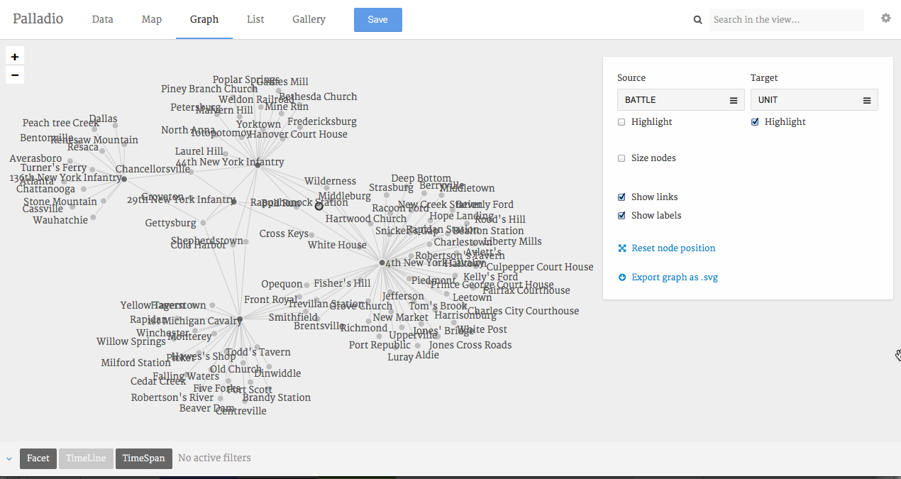
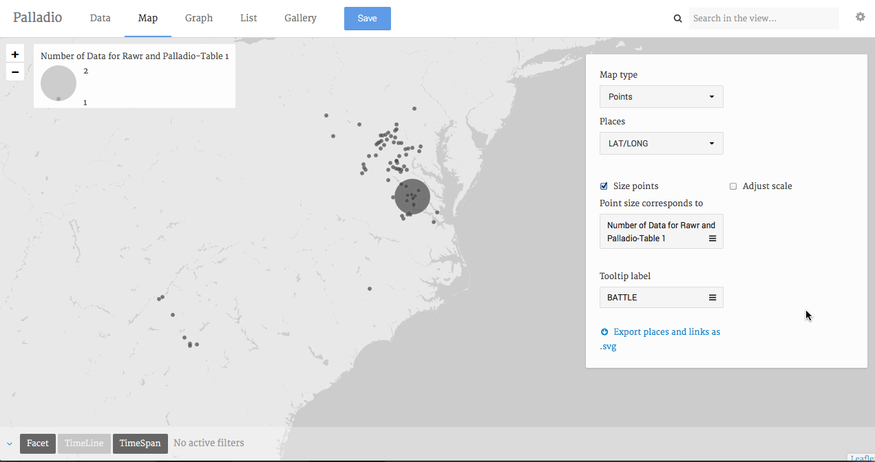
Thanks to Alyssa Fahringer's work of identifying the latitude and longitude of most of the battles, I was able to map the data on the Map view tab. What is produced is a map of dots for each geographic location. You can choose how to label these points (battle name or military unit.) You can also create whats called a Proportional Symbol map. Essentially this means that the symbol increases in size as the quantity for that item increases. Using our current data set, each battle has at least one of our five units present. As the number of units present increases, the symbol for that battle increases in size.This is a great way to visualize the geographic relationships of data.
However, Alyssa and I compared our proportional symbol maps and we found that they were different. While we had used the same data, we uploaded the data differently. I had transcribed the latitude and longitude into one CSV file. Alyssa uploaded the list of battle names and military units and then, using an option provided by Palladio under the Extension option, added a new table of the Battle name and latitude and longitude coordinates. We could not confirm that these two methods provided for the discrepancies in our maps. Either way, both of our maps were incorrect. My map (included below) shows that all but one of the battles only had one of the military units present. This simply is not true. Various battles such as Gettysburg, Chancellorsville, Bull Run, etc. had multiple units, from our sample, present. Alyssa's map showed that each battle had a minimum of two units present which also is not true. When I looked at my data under the Data view page, it shows multiple battles had multiple units present. Why this is not being translated onto the map is beyond me...
RAW
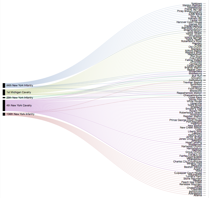
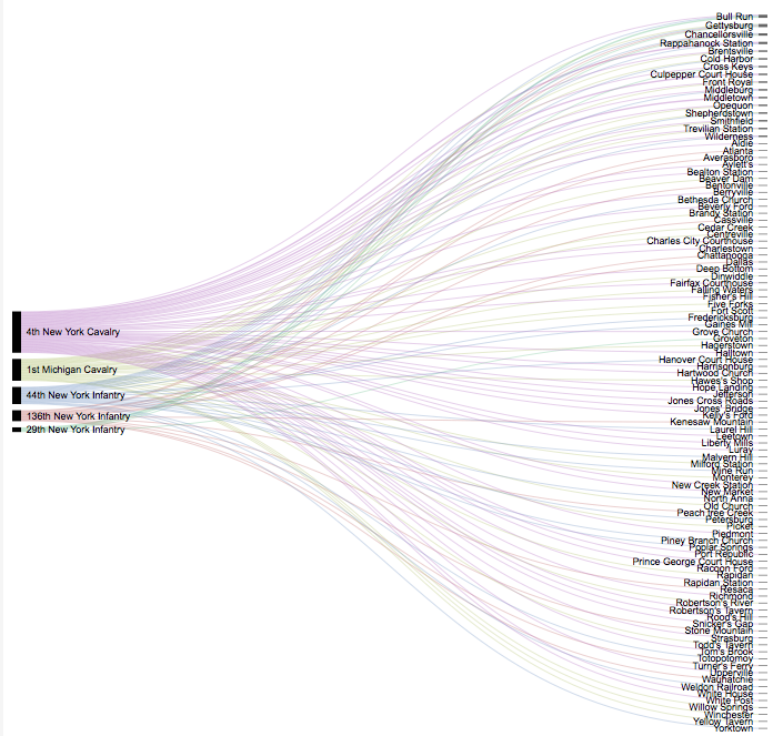
RAW is a program developed by DensityDesign Lab and provides the user with 16 pre-loaded network visualizations. It even allow the user to upload their own charts as well. Uploading data is straight forward (very similar to Palladio.) I included a couple of different network charts below.
Alluvial Diagram
One of my personal favorites is the Alluvial Diagram. It is very fun to look at and illustrates relationships very nicely. However, I noticed that changing the ordering of the variables on the left really affects the "look" of the network. The first image below shows the units organized automatically by the program. I am not sure how the program organizes the data but it would appear that the battles are reorganized on the right to create the cleanest looking network. The second image is ordering the units by size. This puts the 4th New York Calvary at the top followed by the 1st Michigan Calvary. However, this creates a complex looking relationship with the battles. In my opinion, this could give a false sense of the overall relationships between these variables. This is why it is important to organize the data in various ways to gain a full appreciation for the relationships that exist.
Reingold Tilfold Tree
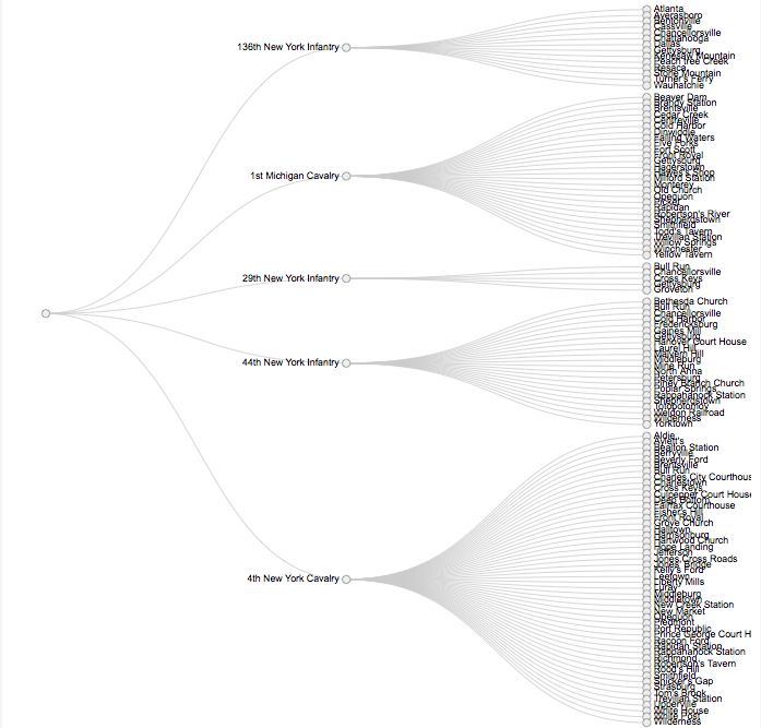
The Reingold Tilfold Tree is an interesting way to investigate the sheer number of battles that each unit took part it. It is almost like a list of battles for each unit, with battles being repeated for different units (i.e. Bull Run for the 1st Michigan Calvary, 29th New York Infantry, 44th New York Infantry and the 4th New York Calvary.)
Circular Dendogram
This last one, the Circular Dendgroam, is almost like the previous network in circular form. My impression is that with a more complex data set, these visualizations would prove to be more useful and even more interesting.
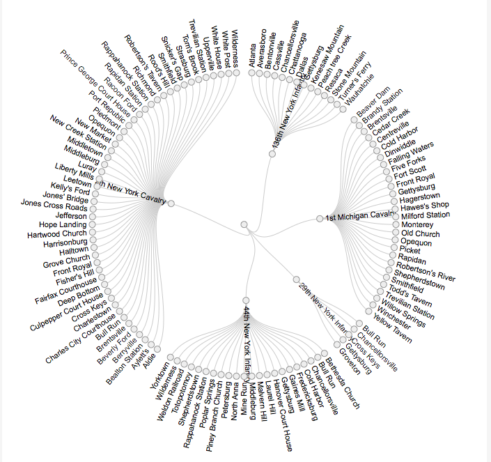
All of these visualizations both reveal and conceal information. These visualizations show the user, very quickly and effectively, what battles each military unit was present at. It highlights the battles that multiple units were at as well. However, no other information is being provided. Did the units interact with each other at these battles? What constitutes "being present" at a battle? Were the units present for the entirety or the battle or just the last day, first day, etc.? How involved in the battle was each unit? Were they towards the rear, in the front, providing support etc.? It is important for a historian or the user to understand that the visualization answers questions and prompts many more.
In comparison with last weeks discussion, how different are these networks from text mining? The biggest difference is the presentation of the analysis. Networks are using the inherent function of the digital medium when it presents the analysis, namely it is visual. Text mining can use aspects of the visual with word clouds but overall, text mining provides counts and numbers. Networks also illustrate various relationships. For example, a network can be created for communications (letters etc.), for topics, for contents of texts, for organizations etc. Networks are then able to be adapted for the more concrete relationships to the more abstract. Text mining dwells mainly in the concrete while topic modeling deals more with the abstract. While this is a weak analysis of the two methods, as my experience with each increases, so will my understanding of how they are similar and distinct.
Digital Visualization and Networks
The next two weeks of topics (digital visualization and networks, mapping) are areas that I have a bit more experience with. While this is truer of next weeks, I found myself going back to my undergraduate training in geography at various times during the readings. I can recognize that my undegraduate training is both a blessing and a curse as I am better versed in these topics but also exhibit a bias with them as well. The readings do a great job of engaging important quesitons or points regardin digital visualization I will touch on the three most important ones:
The first is a question. Why should we visualize data? This is an important question that should not be treated lightly. John Theibault in his article "Visualization and Historical Arguments" approaches what is, in my opinion, the best answer. Theibault states "This essay is primarily concerned with...how do we deploy the visual capabilities of the computer to show what we wish to communicate? It is slightly more ecumenical in...that it sees all uses of visual information to communicate an argument or narrative beyond the meaning of the words in text as forms of visual argument." In essence it is conveying information beyond what the text is able to do. I like how he started his article with the cliche term "a picture is worth a thousand words." While I don't necessarily like or use the phrase, it does illustrate an acceptance and understanding among people that visuals can provide access to a slew of information. When I created and worked on maps, this concept was always weighing on me. I wanted to be using the data in the best way possible. I wanted my map to be clear and to the point. The majority of the time, I achieved this. The visual representation illustrated the data better than the written text. Lauren F. Kline's article "The Image of Absence: Archival Silence, Data Visualization, and James Hemings" is a great example of the benefit of visualizing data. Her examination of of Thomas Jefferson's letters to find James Hemings proved to highlight the silence of the archive. She used an arc diagram to illustrate these connections/relationships. They were able to convey the information quickly and succinctly. In all, it was a fascinating article on archival silence and the shadows that can be found there.
The second question or theme from the reading was balance. Both Johanna Drucker in her article "Humanities Approach to Graphical Display" and Scott Weingart in blog post "Networks Demystified 8: When Networks are Inappropriate" discuss the short falls and caveats associated with digital visualization and more specifically, networks. There are times that the data and narrative does not need or require digital visualization or the visualization would complicate or confuse the argument. Scott Weingart refers to this as the "No Network Zone." Providing some direction he says " a good rule of thumb on whether you should include a network in your poster or paper is to ask yourself whether its inclusion adds anything that your narrative doesn’t." John Theibault refers to superfluous visualization as "chartjunk." It seems like everyone can remember a textbook or article they read where a chart or graph or some type of visualization did not connect with the narrative and thus did not aid the argument. However, I must admit, that I struggle with the idea that visualization, if employed correctly, is not beneficial. My undergraduate training as a geographer has built the mindset that the majority if not plurality of issues can be aided with visualization (in my case, maps.) However, mapping is next weeks topic so I will avoid delving too much into that topic. I do understand that my training and experience as an historian is quite limited. As I progress in the Ph.D. program, I will learn to find better balance in my work.
The third is to know what the data visualization/networks are doing. Johanna Drucker delves into this point when she says "I will argue, such graphical tools are a kind of intellectual Trojan horse, a vehicle through which assumptions about what constitutes information swarm with potent force. These assumptions are cloaked in a rhetoric taken wholesale from the techniques of the empirical sciences that conceals their epistemological biases under a guise of familiarity." While it was difficult to wade through her language, ultimately she is arguing that we, as humanists, need to come to a better understanding of our data and what is being portayed when we feed it through these graphical tools. She talks about data as capta. this means that as opposed to referring to our data as data, which implies that it was given to use like in an experiment, she instead should refer to it as capta which is derived or taken. We as humanists actively pursue this capta and take it from the materials. Re-conceiving what our data/capta is and then understanding what the visualization is portraying are paramount in our roles as scholars and purveyors of history. We must be aware of what we are collecting as data, what is happening to that data during analysis, and how the public is accessing or receiving that data.
Mining "Mormon" in the Text (and Dorian Gray)
By way of introduction to using Text-mining, I was able to play around on four different tools. The first three (Google Book n-gram, Bookworm:Chronicling America, New York Times Chronicle) provide their own corpus of materials that will be mined while the fourth, Voyant, you create your own corpus. For the sake of my assignment, I searched the term "Mormon" through the first three text mining tools.
Google Book n-gram
Google Book n-gram searches through the corpus of books that Google has digitized. You can specify what corpus to use (American English, British English, French etc.) to get a more specified result. You can search up to a 5-gram (a 5 word phrase) in Google Book n-gram, which is nice for tracking the use of certain phrases or titles of companies etc. While I searched "The Church of Jesus Christ" and got nothing in return, I decided to search the more common term, "Mormon" through the database.
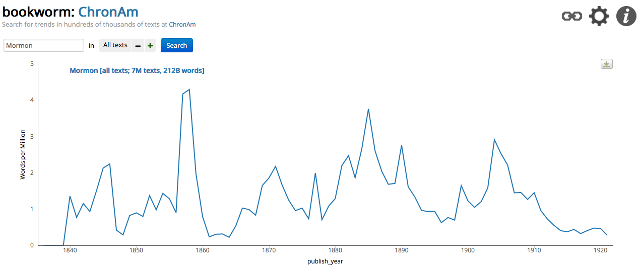
Bookworm: Chronicling America
On the Bookworm site, you can choose which corpus of materials you would like to search. They have five different collections that you can search. I chose Chronicling America as it is a corpus of newspapers, including many local papers, from 41 states and the District of Columbia. At each point along the graph, you can click the value and see the newspaper articles.
NYT Chronicle
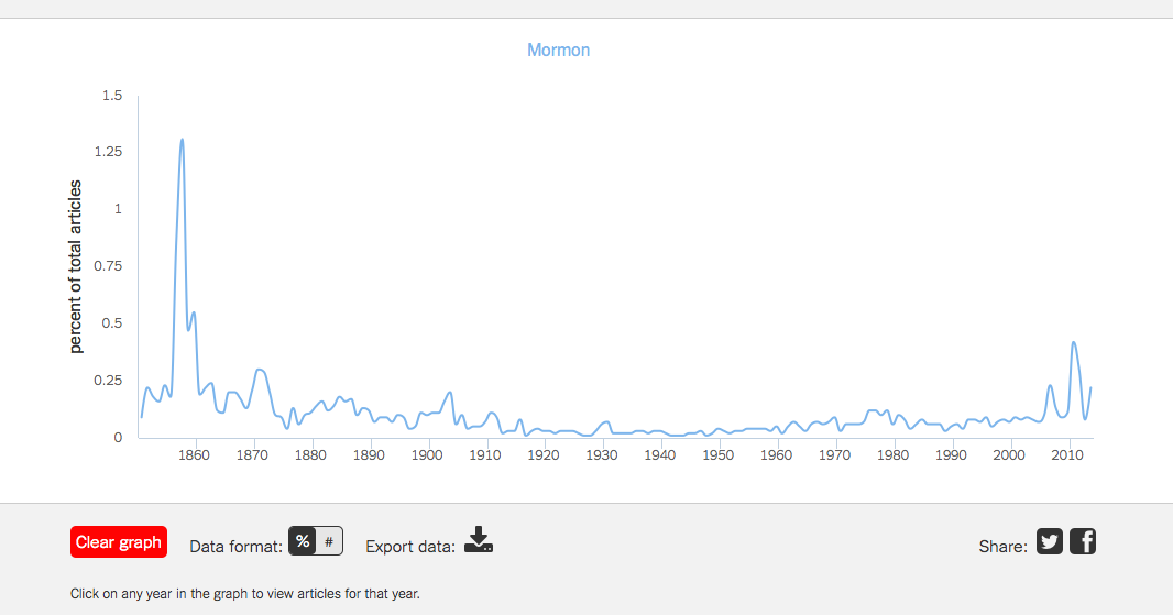
This is a relatively new site. The New York Times provides their entire corpus of work up to the present. At each point along the graph, you can click on a year and view the various articles.
For both the NYT Chronicle and Bookworm: Chronicling America, you can see the term Mormon piques in 1858. It isn't completely surprising since the Utah War occurred from 1857-1858. However, the largest spike in Google Books n-gram occurred in the 1880s. This was a tense time for Mormons as they were at odds with the Federal Government. I am not able to look through the various books listed in Google Book n-gram but Mormonism became a somewhat popular topic to write about. In 1887, Sir Arthur Conan Doyle wrote the Sherlock Holmes book A Study in Scarlet which *SPOILER* had the "evil" Mormons as the antagonists. The 1880s was also towards the end of the difficulty with the federal government. The following decade would see Utah admitted to the Union as a state on January 4th, 1896.
While Bookworm: Chronicling America does not cover the most recent years, NYT Chronicle does and it shows a spike in 2011 in the use of the term Mormon. This can easily be attributed to the Presidential run of Mitt Romney. However, a note on the units of the graph. Currently the y-axis on the NYT Chronicle is percent of articles. When I switched the y-axis to total number of articles, it looks like this:
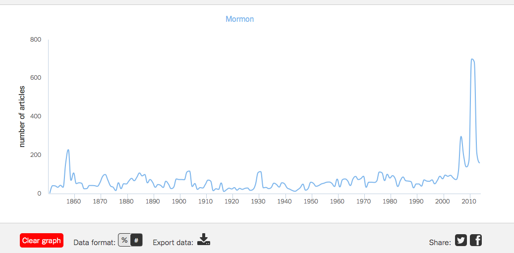
While, in 1858 there was a higher percentage of articles with the term Mormon, 2011 saw more articles written with the term Mormon. I would theorize that the New York Times publishes more articles currently than it did in 1858. This is very interesting as you try to grapple with the numbers. in 1858, a smaller corpus of articles yet a larger percentage covering or including the term Mormon than 2011.
Voyant
Voyant is a Text-Mining tool that can both be accessed through the web or you can download a standalone program. Instead of searching through a designated corpus of material (like the previous three options), it allows the user to upload their own collections via URL or uploading files. After the program has processed your material, it brings you to a page with various windows providing you with data. For this assignment, I uploaded a copy of The Picture of Dorian Gray by Oscar Wilde, both the magazine version and the subsequent novel. This Text-mining project then is comparing the two versions of the story.
In the center of the page, the text of the documents are provided. Here you can scroll through the body of text and it is interactive. Each word can be selected to find out its frequency throughout the documents. On the left side bar are colored dashes that highlight where that word is in the document. With these two documents, you can essentially run a frequency count/index any word that you click on. It is very interesting and fun to play with.
To the left of the main body of text is your summary information. You are provided with a word cloud, a summary of each document, and a frequency count for every word in the corpus. In all three windows, you can include a list of stop words (either a list you create or they provide multiple lists.) A stop word is a word that is inconsequential in the text. Examples would be (the, and, is, are, was...) By excluding stop words you can better sift through the data provided. To exclude words, you click the small gear/cog along the upper left corner of the window.
Along the right side column are windows providing specific information on words that you select from the text. You are given a line graph of the frequencies, the selected/keyword in context, and the selected words frequencies in each of the documents in the corpus. Here, Voyant, allows the user to investigate further their search/keyword. I chose the word "Dorian" out of the Novel text. The graph breaks the novel up into 10 segments and plots each segments total frequency of that word. I am also able to look at the context of each occurrence of "Dorian" as well as the frequency and trend.
Comparatively, Voyant provides the user with a much richer analysis of the corpus of documents. It can easily be manipulated to investigate various words, look for distinct words and even see the context of the words. The three previous programs do not offer those options. Finally, Voyant's capabilities with my own sources over a designated corpus makes it that much more useful to me with my own research. In total, these tools provide an exciting glimpse into the possibilities of distant reading and digital history. I am both excited and intrigued by the possibilities these tools afford me.
Mining and Modeling Text
Digital Historians are not focused only on increasing accessibility to sources. Accessibility is just one facet of the overall benefit of the digital world. I can picture in my mind, trying to explain how a source is made available online to my friend. I could go into detail about what source should be used during the digitization process (the original - not microfilm), the quality of the scanned image, the pros and cons of OCR, the importance of transparency, databases, user interfaces etc. etc. After all of that, they would say, "Yeah, but what can you do with it?" That is the ultimate question. Once we have digitized sources, what then are we suppose to do with it. This weeks readings on text/data mining and topic modeling provide answers to that question.
Text/data mining and topic modeling are two phrases I have heard mentioned around the Center for History and New Media as well as within the community of Digital Humanities yet I did not fully understand what they were. Ted Underwood's article "Theorizing Research Practices We Forgot to Theorize Twenty Years Ago" really helped to shed some light on them. Granted, I do not understand the statistics that go into the "black boxes" of topic modeling or text/data mining, but I can understand the process and end result. Text/data mining is a statistical method to analyze large collections of text. An example of text/data mining would be a keyword search through a database. Topic Modeling is a statistical method that organizes text into clusters of topics or words that tend to occur in the same bodies of text. In essence, it is modeling out the different topics in the collection of texts. Both of these are powerful aids in the research process.
I found it interesting in Frederick Gibbs and Dan Cohen's article "A Conversation with Data: Prospecting Victorian Words and Ideas" that historians push back against these computational/statistical methods. What is more interesting is that I find myself pushing back as well. As Gibbs and Cohen articulate, there is this cleft between close reading (traditionally reading through a text) and the computer-enhanced distant reading ("reading" through a large collection of texts to find over-arching themes, topics and meaing.) It is the notion of reducing a book to the mere occurrence of words. The romantic in me wants to push back against the notion that a novel, or play, or journal can be reduced to just its words. During my undergraduate, I took an online music theory course. At the time, I was dating my wife (well she wasn't then...anyways), and I was explaining how you could break apart music into mathematical sequences. I found it very interesting whereas she pulled back from it. For her, she didn't like the notion that a piece of music that she plays on the piano could be reduced to mathematics. By knowing this, for her, it would somehow degrade the beauty of the music. I can sympathize with that as I read through the text/data mining and topic modeling articles. However, I also find these things extremely interesting. Ultimately, both close and distance reading are important to research in the humanities. Researchers and glean information from distance reading that is not possible to do in close reading, whereas close reading is necessary when doing in depth research on various sources. They both serve the greater purpose of arriving at a better understanding of our past than we had previously.
Another reaction to the reading is how much more needs to be done to better use these methods. In Ted Underwood's blog post "Where to start with Text Mining," he touches on the issue of available, usable sources. Underwood states "Where do I get all those texts? That’s what I was asking myself 18 months ago. A lot of excitement about digital humanities is premised on the notion that we already have large collections of digitized sources waiting to be used. But it’s not true, because page images are not the same thing as clean, machine-readable text." This is an issue I see in my field of Mormon History. What we have is a great opportunity but the resources are lacking. As I have mentioned in my previous post on OCR, our ability to translate images into machine-readable text is lacking. It would appear to me that more should be done to remedy this. It is like we are doing great with Part A (providing digitized sources) and Part C (distance reading) but Part B (OCR - translating digital sources into machine-readable text) is lacking. Maybe I am disillusioned with my recent experiment using Google Drive's OCR...
Also, as a Geographer, I really enjoyed reading Cameron Blevins article "Mining and Mapping the Production of Space." Interactive web maps hold a special place in my heart (yes I know my geek is showing.) His use of text mining for frequency counts of place names in the newspapers was really interesting. I am always looking for ways of utilizing mapping in Digital History and this article is a great example. The maps were fun to play with (although they didn't work on Firefox, had to use Chrome) and they were very well done from a cartographic stand point. This got me really excited to utilize these methods in my own work.
Database Sources in Mormon History
*Caveat: This is not meant to be a definitive analysis of the digital sources/database use for the Journal of Mormon History. This was a preliminary study to fulfill an assignment for a class and to get a feeling for the fields use of databases.
My Practicum assignment for this week was to search through a scholarly journal in my field (Journal of Mormon History) for citations to databases. I was to search through the most recent three years of publications. The Journal of Mormon History publishes quarterly, so I searched through 12 issues. Through those 12 issues, I looked at 86 articles spanning roughly 3,000 pages. With each article I scanned the footnotes for URLs, the word "database", or any other identifier of the type of source. I will list the most common sites/databases and then discuss my reactions.
- lds.org/ensign
- lds.org/general-conference
- josephsmithpapers.org
- familysearch.org
- ancestry.com
- lib.byu.edu
- lib.utah.edu
- sltrib.com
- deseretnews.com
My first reaction was that of surprise. I was expecting to find much less use of digital sources than I found. Out of the 86 articles I reviewed, 60 articles had at least one citation to a digital source or more. I found myself excited about my field's use of digital sources and I was even a bit proud. Mixed into these citations were various source. Beyond what I already listed as the major databases used, I found the Oxford English Dictionary, various blogs, a handful of government websites, and even a citation to colbertnation.com (Bradley Kime's essay "Exhibiting Theology: James E. Talmage and Mormon Public Relations , 1915-1920"). Overall, Mormon History's use of digital sources, including databases, is fairly rich but it still has room to improve.
The way these citations are handled needs attention. Most of the digital sources were cited using a full URL. This means that the reader can navigate directly to the digital source used by the author. This is a valuable function that is not being utilized fully. I accessed the Journal of Mormon History through the Utah State's digital commons. This allowed me to navigate to each of the 12 issues quickly and then download them as PDFs. However, scrolling through the PDF, I found that not a single hyperlink was available, including the URLs within the citations. The Journal is losing one of the major benefits of digital resources by not hyper-linking.
At various points during my assignment, I felt the author used a database but did not indicate that. While I cannot actual state whether the author used the digital but cited the physical, some red flags appeared. One such red flag is the citing of multiple issues of multiple newspapers. While it is possible for the author to scroll through the microfilm for the newspaper it is less likely that she or he will do it for multiple papers. This becomes an even bigger issue when those newspapers are digitized and available online. This is the second red flag. Major newspapers, like the New York Times, have been digitized and made available online. Even more local papers, like the Salt Lake Tribune, are available online (Utah Digital Newspapers) or through their own website (sltribe.com.) This is also true for books that are available through such databases as Google Books or Gutenburg.org.
In conclusion, I want to outline some interesting things that I found. The first is the use of Wikipedia. I had always been taught that using Wikipedia in your research is fine. It is a great launching platform to find other sources as well as a place to help flesh out your research question. However, I was told never to cite Wikipedia as a source. Instead I was to trace the fact/information back to its original source, which often was a more "reputable" source. I was surprised to find multiple articles using Wikipedia in their citations (some as many as five or six times.) Another thing I found interesting was a citation in Father Daniel Dwyer's article "Evil in the Family: Mormons and Catholics struggling with the dark side of Their Histories." When he cited the source, he listed the book as "Kindle edition." I was surprised by this specificity but excited at his thoroughness. This type of documentation is greatly needed in the field. Only then can we begin to understand the degree to which digital resources are being utilized by the field.
Once again, if you have any questions, concerns comments, or jokes please leave a Reply below.
Searching for the right word(s)
This weeks readings have left me in a very contemplative mood. While the topics (databases, digitization, search-ability) were very practical, I am thinking about the theoretical implications of the field. I found myself questioning and examining my own basic understandings of the history and what a historian is and does. Taking that thought process a step further, I thought about the field of history as a whole and where it could be in 10, 20, 50 years.
I found Lara Putnam's statement in The Transnational and the Text‐Searchable: Digitized Sources and the Shadows They Cast about source anchoring interesting. She outlines how in the past, historians have been anchored both by the availability of their sources and to the places where they could access them. Having grown up with the computer and the digital age, as well entering the field of history recently, I never experienced that. The limitation that geography played in the type of scholarship that could be produced is intriguing to me. The change of accessibility to sources not only allows for greater ease wit historians but also allows more historians access to those documents. Then to connect this with Caleb McDaniel's article The Digital Early Republic ,the field needs to cite the digital documents in their writings. It is sad that a historian utilizes the digital resource for a document but does not give that digital document credit in their footnotes. Instead they cite the physical document (I am guilty of this as well.) This vast accessibility needs to be recognized and given credit.
The next step in this process is to establish some sort of system to present the work the historian did in the digital resource. In the hard sciences they speak so much of repeatability. We should, as historians, attempt to present our research in a way that someone can repeat the process and arrive at the same results. McDaniel's example of repeating the same search in the same database as Caroline Winterer yet he came up with 300 more hits is an issue that needs addressing. We should seek after the rigidity in citation that our footnotes have within the digital resources as well.
In connection to accessibility is our understanding of what the digital resource is. James Mussell in his article Doing and Making: History as Digital Practice articulates how we view these digital resources as tools. In this way we often ascribe them a secondary nature to the original document. In doing this, historians as well as the general public can under value or under sell the digital. Towards the end of his article he states "[I]f digital resources (and what researchers do with them) are understood as constitutive parts of the framework through which historical objects become primary sources, then digital technologies and methods become part of historical studies more broadly." I must say that I am one that views digital resources more as a tool. However, as Dustin Hoffman would say as Captain Hook in Hook, "I just had an apostrophe...lightning just struck me brain." Suddenly I could see the digital resource as part of the primary source. No longer just "useful for access or analysis but unworthy of study in their own right." I am then brought back to Mussell's discussion of viewing the document as data. I thought that, that section was very interesting. Understanding that the document, while important in its own right, provides data that is just as important and of high value. That we need to "defamiliarize" ourselves with the digital form in order to see how we can use it more fully. I highly recommend reading this article.
This blog post seems more like I am wandering through my thoughts rather than engaging the reading fully. However, this represents my reaction to the readings. I was left at a theoretical crossroads for how I understand the digital resource, the importance of repeatability and standardized documentation, and about the digital document as more than a tool. These readings really pushed my boundaries for digital history and digital humanities.
h0W gut 1s eht 0cR? (How good is the OCR?)
After this past weeks readings and class discussion on Digitization, our assignment was to do some work with OCR (Optical Character Recognition.) This was a three part assignment: 1. Use Google Drive's OCR (Google Drive Classic has one, their new Drive does not), 2. Look at Chronicling America's OCR and 3. Find an OCR in your field and assess it. This was a very interesting (and slightly deflating) practicum that left me with a lot of questions.
Google Drive OCR
Dr. Robertson supplied images that he took of some Pinkerton Detective Agency Documents. I first ran the assigned image through the OCR without any editing. After I saw the resulting text, I edited the image and ran it through the OCR again.
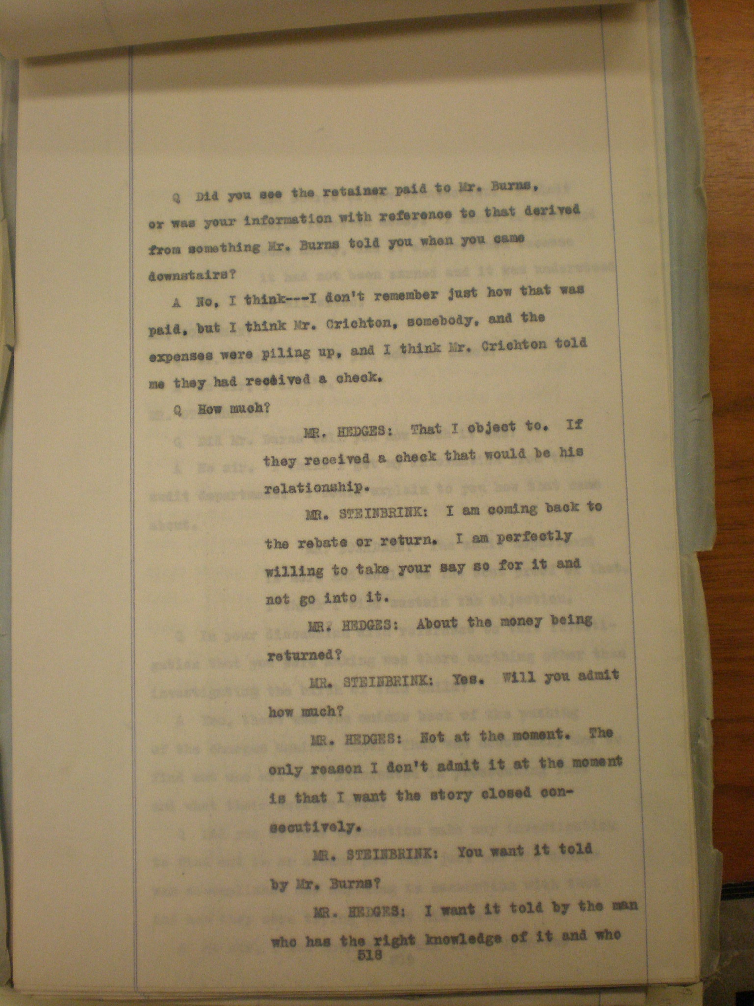
 The Unedited Image did not fair well. Originally I uploaded the image without even rotating it to portrait. The OCR did not pick up any text. After rotating the image, it recognized the text but gave me poor results. It was able to work through the entire document but missed a lot of the words. For example the title "Mrs." was translated into "Hr." a couple times. At one point, the OCR reader got it correct but then misspelled it later in the document. The output text also varied in font style, size and emphasis.
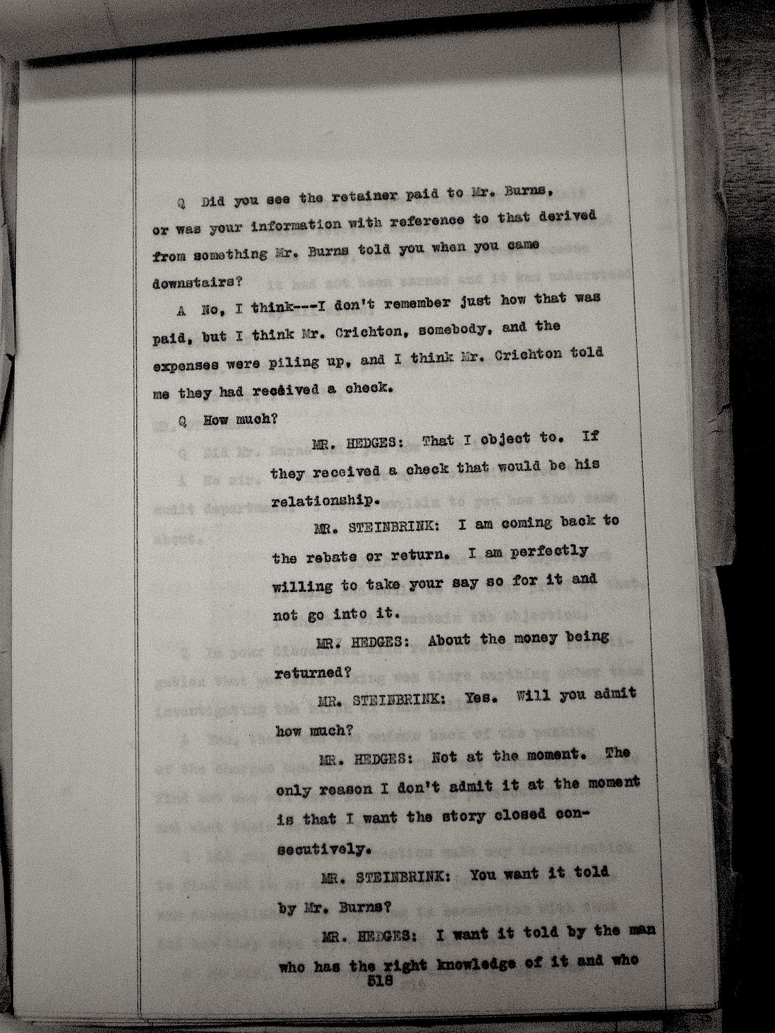
After this somewhat depressing output I decreased the Saturation while increasing the Contrast of the image. This made the text "pop" on the page. It also made the image a grey scale image which in one of the readings it was said to help the OCR function better. I also used the Sharpness setting which helped make certain letters easier to read (e, o, r), though I don't know what exactly it did. The results from the Edited Image were worse than tan before. Not only did it misspell words, it only gave me seven random lines of text.
I shared my results with Ron Martin who was assigned the same image as me. He used Picassa, a Microsoft image editing software. He wasn't able to improve the OCR rate either. We both got pretty shoddy results from the Google Drive OCR.
Chronicling America
Salt Lake City Herald
February 20, 1891; Front Page
The OCR actually did a pretty good job. You can see that it has issues with similar looking letters. For example the word "special," it translates it to "spccal." The OCR did not see a different between the "e" and "c" and completely missed the "i." I also noticed that it doesn't bring any punctuation or symbols over. You can see this in the missing brackets at the beginning of the article as well as the quotation marks on the eighth line. While the OCR did a fine job, the newspaper is in great condition. There doesn't appear to be any issues with folding or bleed through and the text still looks fairly crisp.
Gainesville Daily Sun
January 1, 1905; Third Page
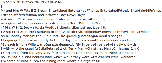
This copy of the Gainesville Daily Sun has seen better days. The pages are very faded and you can see build up of dirt or grime. The OCR struggled more with this page than the previous Salt Lake City Herald. At some points, words are repeated in the text translation. "The guests began to arrive..." has the word guest twice in the text output. I am not sure what the OCR is doing there. You can also see the Merry Christmas line is also repeated twice. I hadn't noticed this issue with the other pages as much as with this page. I am interested to see why the OCR repeats the words in the text output. Compared to the Google Drive OCR, the text is all uniform in size and font. Also Chronicling America's OCR follows the capitalization of the original document.
The Daily Chattanooga Rebel
June 9, 1864; Front Page
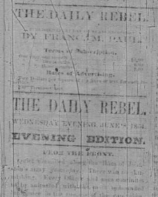
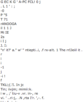
This last page from Chronicling America is older than the previous two. It is extremely faded, crooked and you can see various points of damage from what looks to be creases. I wasn't expecting a good translation from the OCR but I wanted to see what it would pick up. It missed a lot of the text. I also find it interesting that the OCR inserted so much punctuation like dashes, quotations, semi-colons etc. In the previous pages, the OCR missed the punctuation.
Mormon History OCR
Nauvoo Expositor
June 7, 1844; Front page
I couldn't find a website that provided its own OCR that also housed Mormon History documents (outside of Chronicling America.) Instead I went to signaturebookslibrary.org and perused their newspaper section. I found a PDF copy of a the Nauvoo Expositor. While the website I downloaded it from did have facsimiles, I ran the original document through Google Drive's OCR.

The page has some harsh folds, smudge text and an overall faded look. The OCR did fairly well working through the text. You can see a recurring error roughly where the vertical fold goes through the text. The OCR also struggled with some letters that look similar ("a" and "o") as well as catching the dashes for words that were completed on the following line. Overall, I am impressed with the fairly high accuracy from this page. I am interested in putting other pages through Google Drive and seeing the end result.
Digitization and the Questions that come with it
In a very naive way, one would think digitizing documents is just a question of taking the time to do so. If I wanted to digitize one of my undergraduate essays, it would take me less then 5 minutes to scan them with my home printer and upload the document to my website. Simple and quick... However in the larger scheme of digitization and digital history, the process is much more complex then my 5 minute scenario.
What is the purpose to digitizing the document? When I was surfing the web for Mormon History websites I came across one that had some primary sources that had been transcribed into an HTML document. The author of the website did not post scanned images of the original document and I found myself "dinging" that site. I thought, "Well I can't see the original document so I am a bit skeptical." However on another website I found scanned images of newspapers from the nineteenth century. In my mind I ranked this site "higher" than the one that did not have images available. Why did I do that? This weeks readings (Found here) fleshed out the various reasons a document should be digitized. Both of these websites were presenting historical sources but in different ways. Depending on the purpose of my research I could choose one over the other. The transcribed webpages are searchable whereas the scanned images of the newspapers are not searchable. Yet the images of the newspapers allow me to see the layout, font style, spacing, margins etc. of the document, something the transcribed documents don't necessarily provide. Finishing this weeks readings, I have become much more cognizant of the pros and cons associated with each way of digitizing sources. Really, the digitizer needs to ask (and answer) the question of who is my audience and what are their needs in regards to this document.
What about the "false" negative? An important aspect of digitization is Optical Character Recognition (OCR). Simon Tanner in his article Deciding whether Optical Character Recognition is Feasible describes OCR as "a type of document image analysis where a scanned digital image that contains either machine printed or handwritten script is input into an OCR software engine and translating it into an editable machine readable digital text format. " In essence OCR software takes an image of text and converts it into a searchable text document. This process is not perfect. Errors occur and how those errors are mitigated become an important question. One that struck me as profound are "false" negatives. For example, if I have sources that have been run through OCR software to produce searchable documents and I search those documents for a phrase or word like, "Mormon," all the occurrences of the word "Mormon" will be returned. If the OCR software transcribes the word "Mormon" from one document as "Moman" or "Mermon" then that document will not show up in my search. This is called a "false" negative and it presents an issue in research. As a historian, by becoming reliant on keyword search engines of documents, I am putting my trust in the programmers, the OCR software, the website administrator and others that they did quality work. My research becomes dependent on them as well as myself. It is a strange feeling and has caused me to pause for a few seconds before I click the "search" button.
How do we mitigate too much of a reliance on digitized records? The digitized sources that are available are amazing. Between the Library of Congress and various University projects, it is amazing what can be found through the internet. However, this amounts to mere grains of sand on a vast and rich seashore that is history. Ian Milligan discusses this issue in his article Illusionary Order: Online Databases, Optical Character Recognition, and Canadian History, 1997-2010. He compares various Ph.D. dissertations and the sources they use and noticed an increase in some while a decrease in others. One of his concerns is the reliance on the digitized copies has increased in some areas further than it should.The better source was not available in digital form so the researcher generalizes the digitized newspaper for their research. This particular instance may not be a major problem but the idea behind it, that of relying more on easily accessed, possibly searchable sources rather than those not digitized could mean skewed research. This might not be the case but it does cause me to think about my own research and research methods.
Assessing the Digital History in Mormon History
To what level has Digital History become a part of the Mormon History field? One would think that since my area of studies are Digital History and Mormon History, I would already have a firm grasp of the degree to which Digital History has taken hold in Mormon History. However, this is not the case. As part of the practicum assignment for my Clio Wired class, I have done a somewhat cursory investigation into the presence of Digital History in Mormon History. While my search results have returned resources that I was aware of, others came as a surprise.
The largest Digital History presence for Mormon History comes from the Church of Jesus Christ of Latter-day Saints itself. The Church has its own history department. The home page gives you a brief overview of various resources available through the website. Under their "Research" tab you can find a webpage of Online Resources. The Church has brought together a multitude of links both created by the Church History Department, Brigham Young University, as well as other colleges, organizations and libraries. One of the links takes you to Signature Books Library which has available, online, some books on Mormon History as well as assorted digitized (some transcribed) newspapers. Also available through the Church history website is the library catalog which is great if you can actually visit the library (the catalog is online whereas most of the documents are not.) However, both the Signature Books Library and the Church History website are great resources.
A great blog focused on Mormon History is the Juvenile Instructor. This blog is run by a group of academics/historians that "seek to situate the study of Mormonism within wider frameworks, including American religious history, western history, gender history, and, on occasion, the history of the Republic of South Africa." They provide great articles with reference to both contemporary issues and use of primary source documents. Also included on the Juvenile Instructor is a list of other history blogs, Mormon History blogs, and US Religious History blogs.
My Google searches brought up a site that I was unaware of. Historyofmormonism.com operates more as an exhibit space. Under its "Purpose of this site" section it states, "This Mormon history website aims to share that history with the world...[the] site includes a detailed history of The Church of Jesus Christ of Latter-day Saints, as the Mormon Church is properly known, from its founding... up to the current time." It is well managed and even is open to submissions from the public of relevant images and content. While providing a few transcribed primary documents (no digitized original copies available), the sites overall aim is to present to the readers the history of the LDS church (though they admit they are not endorsed by the Church itself.)
Another great resource for Mormon History is Mormon Places. This website is run by one of my former Geography professors at BYU, Brandon Plewe. It provides an interactive map of Mormon history. The map contains over 2,000 places of interest (settlements, congregations, cemeteries, buildings etc.) as points, lines or polygons that can be clicked on for further information. Also, as stated on the welcome page, the goal is to crowd source the information of the various sites. In this way, he hopes to collaborate a better understanding of Mormonism's (Latter-day Saint) history.
There are also resources available that were primarily print in nature but have been digitized or transcribed. The Journal of Mormon History can be accessed through JSTOR or through membership in the Mormon History Association and is a perfect example of a print resource made available through the web. There is a also webpage dedicated to the Journal of Discourses by various Mormon leaders spanning 1851-1886. They offer transcribed copies of these sermons in webpage format. Included in with these sites would be the Harold B. Lee Library's assorted digital collections. These collections range from a nineteenth century Newspaper index to assorted town histories and the like.
In this brief overview, it becomes apparent that there are a multitude of resources available in various mediums. While there appears to be many blogs/discussion sites on Mormon History, online archives and repositories are lacking. With this only being my first year in my MA/PhD program, I am still figuring out both the field of Mormon History as well as Digital History. I am excited to make contributions and participate in open dialogue. If I missed anything important, I apologize and please let me know.
As a caveat: The Church of Jesus Christ of Latter-day Saints or Mormons can be a polarizing topic. Searching the internet can provide a multitude of Mormon histories sites that do no provide an unbiased history (to be fair you can find those for and against the church providing "doctored" histories.) In this way, Mormon History even more so is in need of a stronger digital presence that provides well written, primary source based research.
Digital History: What is it exactly...
A conversation that has become fairly routine for me over the last few years goes something like this.
Me: "I am going to graduate school in history."
Everyone: "Oh, that is cool. What are you studying?"
Me: "I study US history, primarily the nineteenth century. I specialize in religious history, more specifically Mormon history."
Everyone: "That is very interesting..."
Me: "I am also going into Digital History."
Everyone: "What is Digital History?"
...
The question of what Digital History is inevitably comes up. When I first started having these conversations, I would give different answers to that question. I would have flashbacks to Inigo Montoya from the Princess Bride. In one iconic scene, Vizinni yelled (in response to the Dread Pirate Roberts not falling off the cliff) "He didn't fall!?!? Inconceivable!" Inigo responded with, "You keep using that word. I do not think it means what you think it means." Likewise, I kept using Digital History and yet my understanding of it was lacking. I eventually standardized my response by saying, "It is the study of history using information technology." It wasn't until I began my Digital History fellowship at GMU that I learned that even that response is flawed.
With this back story in mind, I read this weeks Clio Wired I class articles which are focused around the question of "What is Digital History?" Each article gave an answer, or I should say gave a part of the answer to what Digital History truly is. In this way my initial reaction is how diverse the field is. Its diversity is not only a product of what it has to offer but the extent of its impact. Mike O'Malley's "Evidence and Scarcity" and Sean Takats' response in "Evidence and Abundance" don't outline what Digital History does but rather its impact on the writing of history. O'Malley outlines that the "long march of examples" traditionally employed to support or bolster a historian's argument may become obsolete because of the digital world of sources. He puts forward a hypothesis that maybe in the future historians will outline their search parameters rather than results, since digital media can, with ease, reproduce the results for other historians. Takats responds by stating that with a mountain of easily accessible sources, historians will likely require the author's research/writing to reflect that. I always picture Digital History as a separate methodology/field and not something that would eventually influence the entire discipline of history. How then will I change on the whole as a historian because of my involvement and use of Digital History?
I really enjoyed by Edward Ayers article "The Past and Futures of Digital History." Its worth noting that my undergraduate degree was not in history but geography (emphasis in GIS). I did minor in history but even still my experience in the field has been hindered by my major choice. At one point in the Ayers' article, he states that time and space are incapable of occupying the same narrative at the same time. This may not appear complex but to me it is profound. In print media, the author must either discuss a specific place over time or a specific time over space. As a geographer, I love talking about space and object's location in space. One of the reasons I became a geographer was because all things occupy a location in space. In a way, digital history then can not only redefine the narrative medium but the narrative itself. After reading that section I began to think of ways to explore both space and time in the same narrative using a digital medium. It was very exciting for me as a digital historian and as a geographer.
Finally, Dan Cohen & Roy Rosenzweig's “Introduction: Promises and Perils of Digital History” addressed a part of digital history that is very important and that I had not thought about. What are the setbacks/caveat/dangers of Digital History? They break these down into five different categories of: Quality, Durability, Readability, Passivity, and Inaccessibility. Without diving into a summation of their arguments, I came away with concerns of my own. The issue of quality, to me, appears to be the paramount danger of digital history. In a world (World Wide Web) where scholarship online has been lacking and rigid styles of writing are not encouraged, quality seems to be on the chopping block. My writing style changes depending on the medium (essay vs. online forum). This issue is something I would like to spend time pondering and prodding to find answers that work for myself as well as can benefit the discipline as whole. Passivity is another pitfall that I see as a major problem, although I would call it complacency. The miracle that is the world wide web is lost on many of the up and coming generations as they don't fully understand the countless opportunities that are available to them because of the internet. It is like "casting pearls before swine." I am left to ask the question, "How do we reduce this complacency?" I don't have the answer but it is important to ask the question.
In all, this weeks readings provided both an answer to the question of "What is Digital History," while providing me with even more questions about Digital History. This is the game that we play in a newer and largely expanding field. I am excited to see how the events unfold and how I will involve myself in this ever changing and ever expanding discipline of history.
Hide and Go Seek on the Web: Your Online Presence
Go to Google.com and search your name. What comes up in the search results is in part a large reflection of your online presence. When I searched "Jordan Bratt," I was surprised to find that little to nothing was returned that had to do with me. Other than my LinkedIn profile picture that came up in the suggested Google Images search, there were some white pages entries and a Facebook search page with my name on it. However another Jordan Bratt showed up a lot. This other Jordan must have spent some time working on his online presence because on the first page of the Google search results alone he had his LinkedIn profile, Facebook profile, Pinterest page, his faculty page at a community college, and a white pages entry. Ultimately, I was severely out done in my online presence.
My reaction to the search results vary. Part of me is fine with my minimal online presence shown through a Google search. I am well aware that I am an avid user of the internet. I am a consumer of social media, the news, various elements of school websites, Netflix, and other sites. In part, I can accept and welcome this level of privacy. However, as it was pointed out to me by my professor, there is a difference between privacy and visibility. While I want to maintain my privacy, I should want to increase my online visibility. Though this Google search does not define my online presence, it does gauge my visibility in a way that I should be concerned with.
The search results page showed me that I do not have an online ownership of my name. It is an interesting and almost unsettling thought. My name is not my own and in some ways less my name than this other Jordan character. Prior to this class, I never spent any energy to own my name. I just used it and always thought of it as my own. This topic is reminding me of Arthur Miller's The Crucible when John Proctor is charged with witchcraft and he cries out "I have given you my soul; leave me my name!" Now, in a much less dramatic way than the Crucible, I have recognized that my name is less my own and that I must put forth effort to own my online name/presence.
Going forward, my online presence needs to be a true reflection of myself. I have had a LinkedIn profile and Facebook profile for a while now. Since starting the Ph.D. program here at George Mason, I have created a Twitter account, Github account, this website and an account on Academia.edu. While I don't plan on just creating a multitude of accounts to increase my presence, I do plan on using these sites to their fullest and most rewarding sense. I need to actively seek out ways to express my academic work, interests and goals online. As my online presence becomes more mature and developed, it will be become a great blessing to my professional self throughout my life. It has become a goal of mine to be able to Google search myself and find sites or articles related to me. Furthermore, I want to find sites and articles that I intend to be visible while not finding things I wish to keep private.