Clio Wired 2: Creating History in New Media is the second in a series of courses focused on the Digital Humanities. George Mason History PhD students are required to take the first two courses in the Clio Wired Series. Clio Wired 2 is an applied history course that introduces students to “doing” history on the web. I took the Clio Wired 2 course in the spring of 2015 from Dr. Paula Petrik. Over the course of the semester, we discussed the various aspects of design, typography, images, and accessibility. We also learned basic HTML, CSS, and photo editing/restoration techniques. Dr. Petrik’s syllabus is available online.
Portfolio
The course was structured around developing a web design portfolio to showcase the various assignments completed over the semester. Each of the preliminary assignments (portfolio homepage, typography, image, and design) are meant to both exhibit and improve your skills in those areas. The final project brings together all the topics and skills discussed over the course of the semester on a singular historical topic. Using a collection of postcards my grandfather, Pvt. Kenneth Bratt, sent home during World War II, I developed a website that narrates his unit’s experiences in North Africa and Sicily.
Blog
Included below are the blog posts I wrote over the course of the semester. The blogs served as a place to reflect on the weekly readings Dr. Petrik assigned or to highlight my progress on the design or technical topics in the course.
Interactivity and the Web
The web offers innumerable benefits to education. Increased accessibility, near limitless storage, the democratization of voice, the lessening of distance and even time. Each of one of these elements are important and used in the dissemination of information. However, the interactive nature of the web becomes uniquely important in education. It moves the educational process from a book based, text framed process to one of variability and experience.
Josh Brown, in his article "History and the Web, From the Illustrated Newspaper to Cyberspace: Visual Technologies and Interaction in the Nineteenth and Twenty-First Centuries," explains the purpose of his paper as trying to articulate the "opportunities for active learning on the part of users." He discusses some interesting projects from the perspective of the history of digital work as well as the history of those in digital work. However, one comment stands out in his quest for active learning. He references Janet Murray in defining two features important to an immersive experience not he web: the database and the "ability to represent and explore the dimension of space." This is perhaps the section that stood out most to me in his paper. Perhaps it is because I am a sucker for discussions of space (thats the geography degree speaking) but space is an extremely important element in teaching history that is frequently lost in books. Sure, various maps are employed (for better or for worse) throughout a narrative but books don't have the space to engage space (you see what I did there?) in a truly productive manner. The internet is able to reintroduce space and all is accompanying component into historical narrative and analysis. Such examples as understanding Mormon settlements through the nineteenth-century using Mormon Places or the storied history of the Washington DC National Mall with Histories of the National Mall.
Collaboration, both between peers and between teachers and students, has expanded and increased exponentially because of the web's interactive nature. This can best be seen in the advent and increase of online classes. During my undergraduate coursework, I was able to participate in two online classes who provided various content that I could engage with as well as assessments that would be recorded for the teacher to grade. Currently, my wife is teaching a paleography class (reading old handwriting) where a student is able to read a document (zooming, panning etc.) transcribe the document and submit that transcription for her to grade. Online repositories for programmers such as Github, allows users to post code that can be individually downloaded, edited and even uploaded again. Personally, I have been able to download various repositories to use in my own research or even to explore and learn how such programs are written.
Interactivity on the web creates an environment of variability and experience. No longer is a historical narrative limited to a flat page. The user is able to engage in active learning by exploring space or manipulating documents digitally. And the interactivity of the web is only going to increase with the growing mobile device market and the advent of the quantified life/self. Perhaps if you were to ask me "what is the most important aspect of the Web" in a months or two or even in week, I may choose a different element. However, the here and now Jordan sees the interactivity of my web as the most important both in my web experience and in my educational pursuits.
Accessibility and the Web
Accessibility is an interesting topic, one that I have not devoted a whole lot of time to in practice or in thought. This is not to say that I have not interacted with or have experience with people with various disabilities. My senior year in high school, I took an American Sign Language Class where I learned the basics of the language as well as the culture surrounding the deaf community. Also my father is hard of hearing. He sustained substantial hearing loss in his right ear from the gunfire was involved with during hiss tour of duty during the Vietnam War. I also had the fortune to know a blind piano tuner and musician. Ron Harvey was a member of my church who would play the prelude music before the meeting began. A member of the congregation would walk him to the piano bench where he would play until someone came to take him back to his seat. I remember him telling me that he had to choose between playing the guitar and being able to read (playing the guitar would increase the callouses on his fingers making it difficult to read braille). I found that situation quite jarring from my world experience. At any rate, these experiences have helps me better understand those with disabilities but for whatever reason, did not translate into my coding/web practice.
I really liked Jared Smith's article 10 Easy Accessibility Tips anyone can use. I liked it for two different reasons. The first is for its relative practical application. He wasn't lying in the title when he called them "easy tips." Almost all of the tips used various elements already present within HTML. Such things as using an <h1> instead of a <p> tag for the Title of the page, making use of the <caption> tags (again) instead of the <p> tag, adding alternative text to various items on the page etc. All of these techniques are using what html has already provided. In connection with this, Smith's article touches on the notion that poorly accessible sites don't utilize these techniques. This means that poor (or naive for the new acquired) coders are in some ways causing a hinderance to accessibility. For whatever reason, I found this to be fairly profound. So not only is there a proper etiquette to coding (indentation, commenting, naming paradigms like camel-case etc.) there also should be common etiquette in using the tools provided to enhance the quaintly of the web page for all end users.
Dive Into Accessibility is a great resource to explore the various reasons for and ways to increase accessibility. Like I mentioned at the beginning of my post, I have little to no experience with accessibility when it comes to the web. Dive into Accessibility outlines techniques that will aid such accessibility programs as JAWS or Home Page Reader as wells browsers. In preparing and developing my final project, I will definitely be using it as a resource to improve the accessibility of my webpage. I will be bookmarking this page for future use...
Critiquing Ben's Image Assignment
Benjamin Brand's Image Assignment
Positive Feedback:
- I liked the overall theme running through all of you images
- Your experience of cropping the image of the 8th New York only to notice that you cropped out he only African America is an interesting narrative. The restoration work you did on it was thorough.
- I liked how you historicized your color choice for you re-colorization. It moved me to a better reaction when I looked at the uniform, knowing that you sought historical accuracy.
- Your choice to apply a vignette to the image of Lincoln with his Generals was a good call, even if it didn't turn out that well in practice.
Points of Improvement:
- Your engraving could use some more work. There isn't a major change between the original and the matted engraving. Perhaps a starker contrast and maybe applying a light hue of another color will provide a better output.
- Your re-colorization could benefit from restoration work. It looks to be hampered down dust and scratches.
- Your 8th New York restoration looks good. However, perhaps some attention could be given to lightening the image. It is difficult to see how much lightening you were able to apply but using contrast/brightness or other settings/filters/tools, you might be able to improve the contrast of the soldiers.
Good Job, Ben!
Practical Image Editing
This weeks readings on images were set more on practical topics. While last weeks of focused around the ethics of altering images (either before the photo is taken or after), this weeks focused on the practical knowledge needed to alter images. Personally, I still haven't answered the ethics in photo editing fully but that is something that probably comes with time and experience. As I work more with images, especially in a digital environment, I hopefully will be able to work through what I feel comfortable with in editing photos. Really its the historicity that weighs on me...anyways, this week moved beyond that discussion into various techniques that can diversify the impact and appearance of the images you use.
Chapter five in The Non-Designers Photoshop Book was both refreshing and new to me. Entitled "All-Powerful Layers," I am well aware of the power and importance of using layers when dealing with a visual medium. In GIS, overlaying various data layers allows for better map design as well as deeper analysis of the problem in question. The set up is similar between photo editing or creating and cartography. What is the background on an image would be the baseman in cartography (whether it is a physical or political map). Then each layer is added to provide an additional aspect, item, variable to complete the wanted environment or image. Essentially, this reading provided me with the practical knowledge of how to use layers within photoshop. While I was able to read through it, I definitely need to spend time working through using layers in photoshop to be as comfortable with it as i am with using layers in a GIS work. I will say as and addendum: one of the great benefits of using layers is the "protection" it gives to your work. If all the editing and processes are done on one layer, if you make a mistake, that mistake affects everything. Whereas with layers, if you make a mistake on a certain piece, the other layers are held separate and aren't affected by the error. This technique allows for better work (and error) management.
The two other topics from the lynda.com videos are ones that intrigue me but for different reasons. Photo restoration is something I would like to develop a skill set in. As a historian, being able to mitigate damaged/aged photos on your own rather than relying on another individual will save time and effort. It will also help to diversify you as a historian and bring satisfaction in the restoration you are able to manage. However, color restoration intrigues me as I struggle with its overall purpose. I can understand colorization for more hobby and "fun" purposes yet as a historian, I don't fully see the venue in which I would want to use it. Overall, I feel that in order to "color" a BW photo, I would need to have researched the focus of the image enough to justify my color decisions. This goes back to my questions about the historicity of various photoshop techniques.
In total, this week provided practical information that will come in useful as I move forward with the image assignment.
Picture this...
This weeks readings were an introduction to Images and Image editing. I found the series of articles by Errol Morris to be very interesting (part one here). The series discusses the Resettlement Administration, later the Farms Security Administration, and their photographers division. Questions of authenticity have been raised both at the time of the F.S.A. and contemporarily. As I am not a twentieth century historian, I found the story very enlightening and interesting. At the core of the story is the issue of ethics in photography, more specifically documentary photography. I didn't come out of the articles with a clear understanding of what is and isn't right in photography but I understand more the breadth and depth of the topic. I would recommend reading through the articles if you have not.
I am excited to delve into image editing. This is a skill that I have wanted to improve for a long time. Reading through chapter ten of White Space is Not Your Enemy by Golombisky & Hagen really laid a good foundation to build on. I liked learning about the various image types (jpeg, gif, tiff etc.), their uses, and their limitations. Often times, I think, most people use jpeg because it has become one of the most common image file types. However, learning how gif files can handle transparency whereas jpegs cannot helped as I was editing some images and needed a transparency. I was able to save the files in the better format. Storage formats for files can be overlooked as an important facet to document preservation. When imaging documents in the archives, understanding the resolution, dpi, file type, etc. becomes important in your ability to use the files later in research, writing, and even publication.
By way of an update: After reading through last weeks material (March 2nd) on Color, I have been searching for a good color tool to have on my laptop. While I wanted the program to have the basic functionality of choosing rgb values/mixing them to create your own colors, I also wanted it to be able to identify colors off my screen. My reasoning is that often times I will come across a color or color scheme on a website that i really like and want to use it. Well, after looking around a little i found a great program and I thought I would share. It is called Color Picker (the first program listed on this site). It has a great UI and works seamlessly when switching between programs. It is also FREE, which is amazing. The downside right now is that it is only available on a Mac OS X platform (sorry PC users). At any rate, I would recommend it to everyone.
Color me #C60C30, #002244, & #FFFFFF
I want to commend everyone for their work on their typography assignments. It has been fun, thus far, to see the progress everyone is making in the web design. It was interesting to see everyones approach to their topic, how they incorporated their topic into their design, and the overall structure of the website. There is something about being able to instantly see the fruits of your labors that makes the process so satisfying...
This weeks readings and assigned websites were mostly a refresher for me. In my cartographic design class we spent a week on color as it is one of the primary elements of a map. An important rule to remember in cartography is the colors you use convey the data. This is especially true when designing physical maps and some thematic maps: such as a choropleth, various isoline maps or sometimes proportional symbol. As a cartographer, it is paramount that you choose your colors carefully and with purpose. When developing a choropleth map, ColorBrewer2.org was a valuable asset in design. The website provides carious color schemes taking into account the type of data, number of classes, and even the various data that would overlay the colors (roads, labels, state boundaries etc.) An added struggle in cartography is the difference between additive and subtractive colors. I am glad this was discussed in the readings as it was a struggle for me in some of my undergraduate classes. Since all computer screens use additive colors (RGB) to produce the various hues and gradations of colors on a screen, the subtractive color process (CMYk) of printing became a challenge. The colors I would employ in designing my map on a screen were not always the colors that came out of the printer. I can remember developing a choropleth map from 2010 census data. I had chosen blue as the primary color to show the various percentages of unmarried households in New England. However, the map was to be printed and I must have printed it 6 or 7 times to try and get the printed blue to match the blue on my display. It can be a tricky process. (Map included below...)

Reading through both White Space is Not Your Enemy and The Non-Designers Design Book helped to remind me of the complexity of color. Everything from the hue, saturation, value to split complimentary colors, a lot of thought is required. Understanding the basics (what is covered in the two chapters we read) is important to maneuvering through the "color world". Being able to understand primary, secondary, and tertiary colors as well as what the color wheel looks like is a great aid in the designing process. While as daunting as this may appear, the process of choosing your colors is fun and exciting. It is extremely satisfying when colors begin to "click" and you can see your palette form before you. As a cartographer, within ArcGIS (the mapping software I used in my undergraduate), I tended to use the HSV settings on the Color menu. In my opinion, it was easier to locate a color then relying on the RGB slider etc. However, currently, I do not have a color menu such as the one provided in ArcGIS. I appreciated that Dr. Petrik provided those two articles (here and here) as well as a link to the W3C Color Names page. I would like to have a program on my computer to develop and create color palettes.
As a word of advice from someone who has experience in design: don't be afraid to change design decisions (such as color choices) down the road in your project. As your content comes together and you webpages come along, you may find that the colors you chose simply do not convey the message you want. Do not feel "stuck" with colors because you have been using them for a large portion of your design time. Just as in maps, colors are vitally important to convey data and an overall message to the reader, the colors on your site should create an atmosphere conducive to the historical experience recounted therein.
P.S. For your viewing pleasure: A Hex color clock
P.S.S. The Hex color values in the title for this post... they are the official colors for the Boston Red Sox.
Cancelled Class and Typography Assignment
The readings this week for Clio II were light...so light we didn't have any. Instead, I will give a brief update as to my progress on both the "Cancelled Class Assignment" and my "Typography Assignment" (following Alyssa's lead) :
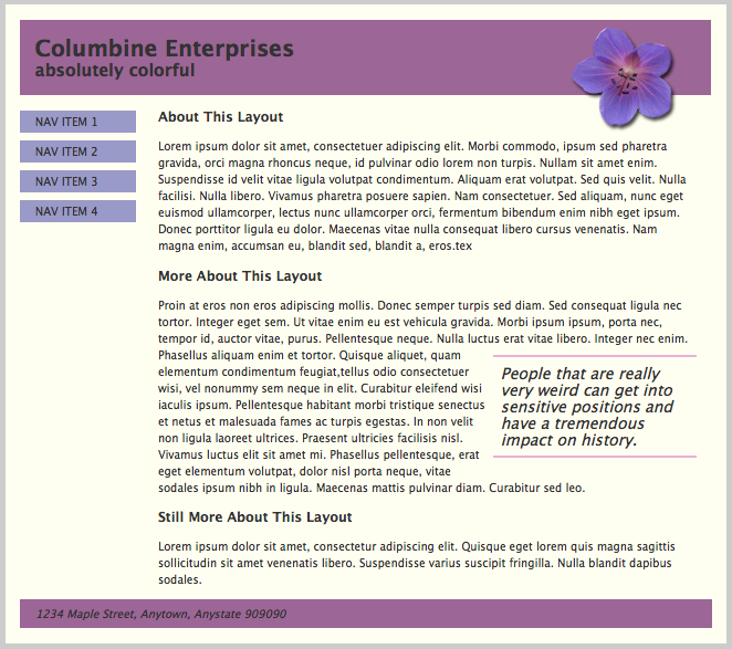
Cancelled Class Assignment: With campus closed and class cancelled on Monday the 16th, Dr. Petrik asked us to continue to work on the Columbine Enterprises website that we originally started on the 9th. She included in her email a screenshot of the finished website, a html and css file to use and an image file to incorporate in some way. I can definitely see an improvement in my understanding of html and css. I was able to recreate the site fairly quickly and without too much strain. The last part that I was trying to fix was having the container extend beyond the footer to give it that border. For whatever reason, I could not figure it out. However, after walking away from it for a little bit, the answer popped into my head (padding-bottom on the container) and I was able to remedy it in about 30 seconds. Overall, I feel pretty confident in myself to create a webpage and style it on my own. I included a screen capture of the finished page.
Typography Assignment: I have been working on the typography assignment that is due this coming Monday. I chose a prayer recorded in 1856 from Jedediah M. Grant in 1856. I decided that the fonts should reflect both the time period and give a ecclesiastical feel. I downloaded some fonts from FontSquirrel and uploaded them to my server. I wanted to host the fonts I use on my own server (both for the longevity of the font and for the experience of using .ttf files). I was able to include an image of Jedediah Grant that is in the public domain. Overall I am happy with the way it has turned out thus far. I am going to step away from it for a little bit to let my mind reset and then return to it fresh. If you want to see it (as a work in progress) follow this link.
Planning and Structure
This weeks subject of Structure was very helpful and interesting to me. Coming into this course, I felt comfortable with basic HTML and CSS. I knew about the various tags, using class or id, styling with a CSS file etc. I had learned those skills during my undergraduate coursework. However, I was taught these skills in a somewhat round about manner. After completing the HTML & CSS course on Codecademy.com, I focused the rest of my time on designing and implementing an interactive online map. Other than a handful of divs, my body tags were pretty empty with the most of the content coming from Javascript running in the header and being placed within those div tags. This meant that I came out of the class without much experience or understanding of how to structure a webpage and the planning and organization that goes into it. (Rightfully so, the course was a Capstone: Web Mapping class not a Web page design class...) At any rate, this weeks material helped to put web design in perspective and gave me some things to work on.
Golombisky & Hagen's White Space is Not Your Enemy (chapters 4-6) was short and to the point about structure and planning. After reading through the chapters, I almost feel like they are a checklist for designing a site. If not an actual checklist of tasks to complete, it is most definitely a check list of things to pay attention to/mentally address. I started thinking about my Portfolio Homepage draft that we turned in last week as I read through the elements and principles. I can proudly say that some of the items I did think about when designing the site but only a few. Applying their criteria will definitely polish and improve my own website. I definitely want to spend more time on positive and negative space (I think I struggle with this design aspect). My natural inclination is to group everything close together which does bode well for a websites overall aesthetic and flow.
I found Jakob Neilsen's article "Guidelines for Visualizing Links" to be both informative but a bit restricting. He introduced important points to think about regarding the design of links (his point about Red/Green colorblindness was something that never crossed my mind...). However, I found that he was a bit too restrictive. It seemed that he didn't give enough credit to the end user that they will be able to identify the links on the page. I am of the mindset that more and more, individuals can intuitively understand webpages (at least on a basic level such as hyperlinks). Neilsen articulates that you should not underline any text, even if your hyperlink design style does not have the links underlined. He attributes this rule to the notion that any underlined text give the appearance of a link and will confuse the end user. While there may be reasons to avoid underlings text beyond Neilsens, I found this rule to be overly sensitive and too restrictive. I think end users rely more on the color of the text and the changing cursor icon to identify a link than on the underline.
The lynda.com videos on "Creating a First Webpage in Dreamweaver" were instructive but, for me, a bit cryptic. While I have been using Dreamweaver, I prefer using text/HTML editors because I like writing the code myself (both the HTML and CSS). It could have been the authors style of teaching but his CSS was managed almost entirely through Dreamweaver's interface with the actual stylesheet hidden most of the time. There were points where he would bring up the style sheet and shot the actual CSS but it was intermittent in his lessons. Beyond that, I enjoyed watching the section on media queries to make your website responsive to tablet and mobile devices. I had always wondered about how that was done and I understand in Dreamweaver and I think I understand on the CSS itself.
The Typical Type is not your Type
I have always had a curiosity when it came to things like typography. Almost a "Jeopardy" style interest in learning various facts about type and its history. My wife has had a vested interest in this field as well. She worked in a book restoration and bindery for a little while and has done some work in conservation. I have studied typography briefly in my cartographic design class during my undergraduate degree. However, the focus was on the use of type on maps for labelling various items and features. The chapters from the various books were pretty interesting. They provided a needed framework in order to traverse the various types of fonts and the design techniques employed in their use. After reading through the books, I found myself noticing the various techniques in other articles and platforms i used throughout the day. It is surprising to see how various venues use or misuse typography. I will most definitely have to refer back to these chapters as I work on my final project and even after my time in Clio 2.
Errol Morris' two part peace in The New York Times, "Hear, All Ye People; Hearken, O Earth,” (Part 1 & Part 2) was very interesting. His almost impromptu experiment proved that the details matter. While I can say that I was not surprised by his findings with Comic Sans, I was surprised that Baskerville proved to be the most convincing type. I have used it at times in my own work but not very often. This led me to ponder about how within academia, it has been generally standardized to submit work in Times New Roman. This standardization gives each paper an equal footing in the professor/grader's view. One could argue that if they accepted any font styles, then a student could influence their grade for the better (or worse) just by the typeface. I am still interested in why Times New Roman is the "go to" font. My preliminary readings on the question has only provided the "it just is" or the "it was the default font on the first word processor that everyone used." At any rate, Morris shows the importance that font can have on credibility and acceptance in society. That is extremely important to know as I expand and continue to write in the public sphere...
I would just like to state that I love footnotes (even more than endnotes). I came into the History PhD program from another discipline. My undergraduate time in Geography placed me firmly in the APA citation style. Though I didn't write many papers as a geographer, when I did, I didn't find APA that important. However, since converting over to History and Chicago style, I have found footnotes to be much better than APA or MLA for that matter. I love being able to get to the citation/note quickly and that it is so close the section of text that is cited. Both Alan Jacobs' piece "The Technology of a Better Footnote" and Dr. Paula Petrik's "Scholarship on the Web: Managing & Presenting footnotes & endnotes" delved into the issues surrounding footnotes in a digital medium. While I can relate to some of the frustrations listed by Jacobs, I felt that some of his complaints were dated and subsequently resolved. His annoyance with mis-numbering footnotes come from a time that predates the modern word processor where those issues are managed by the program.In essence, the process of applying footnotes has advanced beyond his unfortunate experiences. I also found the complaint that footnotes are distracting to be a bit childish (perhaps my bias is showing here). The idea that having footnotes on a page distracts the reader seems far fetched. Footnotes tend to be composed of text (as is the narrative itself) and are "tucked away" at the bottom of the page, after a page break. If someone is distracted by footnotes, then it would appear that the narrative is not engaging the reader all that well (okay my bias is definitely showing here).
However, both articles discuss the various ways footnotes/endnotes can be addressed in a digital medium. I can totally agree that with a vastly different medium, like the digital, a newer form of footnote or citation should be employed. While I liked the popup footnotes referenced in Dr. Petrik's article, the best system I have found has been in my LDS scriptures app on my iPhone. When reading through a verse and a footnote is present, the user can tap the footnote which "pulls up" a window from the bottom of the screen with the selected footnote at the top of the list of footnotes. In my opinion, this allows the user to remain at the same position on the page and mitigates the footnote covering up the bulk of the text. I provided a screenshot below for reference.
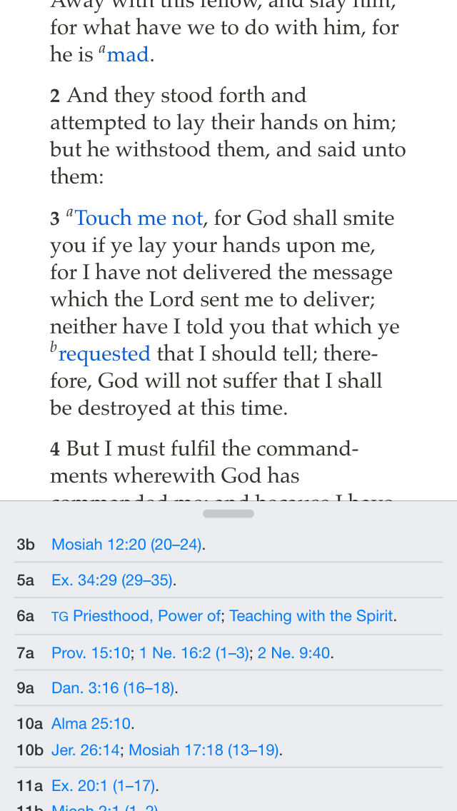
(As an aside, the image is also an example of mixing fonts with the body of the text a serif font while the footnotes themselves are sans-serif.)
The Credibility of Design
I am looking forward to the course and the material we will cover. As I mentioned in class, I have some background in HTML/CSS and Javascript from my undergraduate time at Brigham Young University. I enjoyed the work I was able to do (here is a link to my web map) and wanted to continue to work in that field. My hope is that this course will be a great supplement to what I have already learned and will fill in the gaps as well as reinforce the aspects that I struggle with.
Beginning the course with design is great. As the readings articulated, the quality of the web design is directly correlated to the perceived credibility of that same site. The Stanford Web Credibility Project articulates the high priority that the public places on design in reference to credibility. I found myself divided on their findings. As a historian, I was a bit frustrated that questions of credibility, the source and the context did not drive the public's paradigm for web credibility. Misinformation can be shrouded by well done design. This prompted me to remember a conversation I had with my GIS and cartography professor during my undergraduate. When designing a map, the cartographer has to make a lot of decisions that affect not only the way the map appears but how that data is portrayed to the end user. There are design techniques that, when used in certain ways, can lead the end user to draw one conclusion versus another. My professor, half jokingly - half seriously, quoted Spiderman when he said "With great power comes great responsibility." and then said "Use your powers for good." Throughout my undergraduate experience, with every map i designed, I tried to be fair in the presentation of the data. The Stanford Web Credibility project ultimately led me to affirm even more my choice to pursue Digital History. I want to be able to build websites that both are aesthetically pleasing and providing credible information.
I really enjoyed Jill Lepore's article in the New Yorker "The Cobweb: Can the Internet be Archived". I have used the Wayback Machine and have spent time reading about the efforts of the Internet Archive. More so, I am married to an archivist and book conservationist. We have had long discussions on digital vs. analog, degrading mediums of preservation, and technologies place and influence in the archiving field. Lepore's piece did a great job of articulating the strengths and the weaknesses of the Internet Archives goals. It also highlighted the difficulty that is privacy and copyright. Longevity is an issue in both preserving the information as well as preserving the medium of the information. In Clio I, we read a fair amount on the topic of using digital sources (mainly websites) in your research and the issue of reproducibility. If I used a database that gave me access to 10,000 documents with OCR and arrived at conclusion A, and if another person looks in the same database which now has 15,000 documents with OCR and arrives at conclusion B, who then is correct? Beyond that, does this affect the arguments you are making as a historian. I found this topic to be extremely fascinating and presenting a whole series of issues and questions. Perma.cc is an interesting approach and attempt to mitigate the issue of websites in footnotes. I know I am planning on using the Internet Archive to "track" my own web site.
I am excited to be a part of Digital History. The possibilities are enormous and continually expanding. In some ways, I would agree with Stephen Ramsey in saying DHers need to be building something (blog posts found here and here). By default, the medium used by Digital Historians is visual. This should force our work to progress with the digital and take full advantage of all the digital has to offer. This class, then, will be providing us as historians, valuable skills both practical and theoretical. I am excited to learn, and just as excited to build.