I have always had a curiosity when it came to things like typography. Almost a “Jeopardy” style interest in learning various facts about type and its history. My wife has had a vested interest in this field as well. She worked in a book restoration and bindery for a little while and has done some work in conservation. I have studied typography briefly in my cartographic design class during my undergraduate degree. However, the focus was on the use of type on maps for labelling various items and features. The chapters from the various books were pretty interesting. They provided a needed framework in order to traverse the various types of fonts and the design techniques employed in their use. After reading through the books, I found myself noticing the various techniques in other articles and platforms i used throughout the day. It is surprising to see how various venues use or misuse typography. I will most definitely have to refer back to these chapters as I work on my final project and even after my time in Clio 2.
Errol Morris’ two part peace in The New York Times, “Hear, All Ye People; Hearken, O Earth,” (Part 1 & Part 2) was very interesting. His almost impromptu experiment proved that the details matter. While I can say that I was not surprised by his findings with Comic Sans, I was surprised that Baskerville proved to be the most convincing type. I have used it at times in my own work but not very often. This led me to ponder about how within academia, it has been generally standardized to submit work in Times New Roman. This standardization gives each paper an equal footing in the professor/grader’s view. One could argue that if they accepted any font styles, then a student could influence their grade for the better (or worse) just by the typeface. I am still interested in why Times New Roman is the “go to” font. My preliminary readings on the question has only provided the “it just is” or the “it was the default font on the first word processor that everyone used.” At any rate, Morris shows the importance that font can have on credibility and acceptance in society. That is extremely important to know as I expand and continue to write in the public sphere…
I would just like to state that I love footnotes (even more than endnotes). I came into the History PhD program from another discipline. My undergraduate time in Geography placed me firmly in the APA citation style. Though I didn’t write many papers as a geographer, when I did, I didn’t find APA that important. However, since converting over to History and Chicago style, I have found footnotes to be much better than APA or MLA for that matter. I love being able to get to the citation/note quickly and that it is so close the section of text that is cited. Both Alan Jacobs’ piece “The Technology of a Better Footnote” and Dr. Paula Petrik’s “Scholarship on the Web: Managing & Presenting footnotes & endnotes” delved into the issues surrounding footnotes in a digital medium. While I can relate to some of the frustrations listed by Jacobs, I felt that some of his complaints were dated and subsequently resolved. His annoyance with mis-numbering footnotes come from a time that predates the modern word processor where those issues are managed by the program.In essence, the process of applying footnotes has advanced beyond his unfortunate experiences. I also found the complaint that footnotes are distracting to be a bit childish (perhaps my bias is showing here). The idea that having footnotes on a page distracts the reader seems far fetched. Footnotes tend to be composed of text (as is the narrative itself) and are “tucked away” at the bottom of the page, after a page break. If someone is distracted by footnotes, then it would appear that the narrative is not engaging the reader all that well (okay my bias is definitely showing here).
However, both articles discuss the various ways footnotes/endnotes can be addressed in a digital medium. I can totally agree that with a vastly different medium, like the digital, a newer form of footnote or citation should be employed. While I liked the popup footnotes referenced in Dr. Petrik’s article, the best system I have found has been in my LDS scriptures app on my iPhone. When reading through a verse and a footnote is present, the user can tap the footnote which “pulls up” a window from the bottom of the screen with the selected footnote at the top of the list of footnotes. In my opinion, this allows the user to remain at the same position on the page and mitigates the footnote covering up the bulk of the text. I provided a screenshot below for reference.
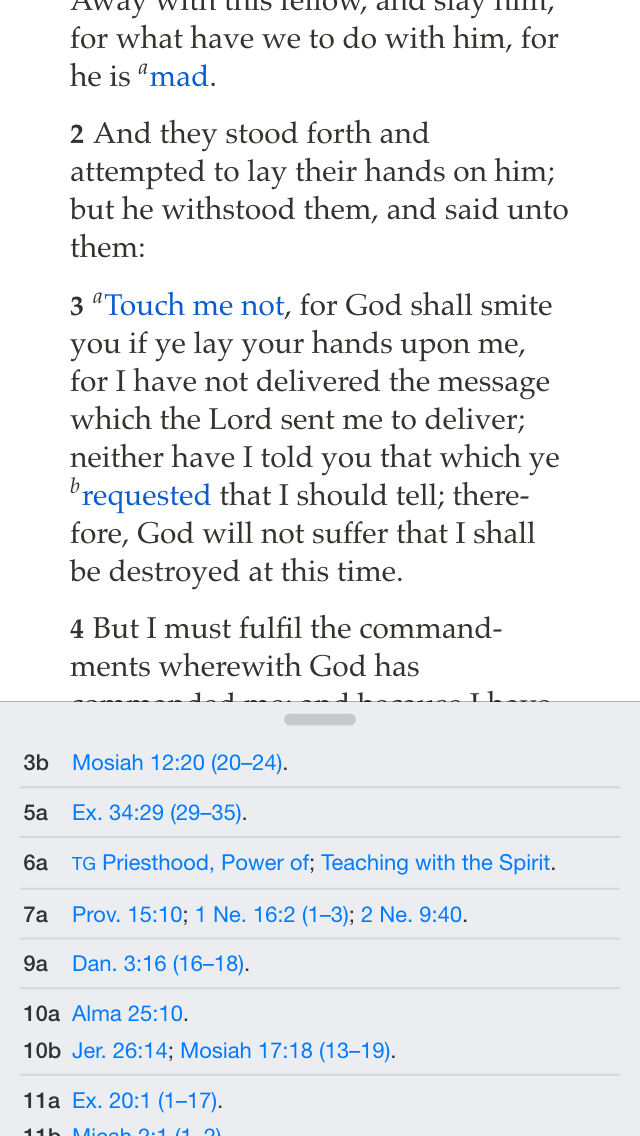
(As an aside, the image is also an example of mixing fonts with the body of the text a serif font while the footnotes themselves are sans-serif.)
Hi Jordan,
I’m curious as to whether you have attempted to use the LDS Scriptures app on devices other than your iPhone, such as an iPad or a computer (if the app is even available for tablets, etc.). We’ve discussed in class how various sites look different based on what device you are viewing the site with, and so I was wondering if the app works the same way on devices other than smart phones. The designers of the app have found an uncomplicated and user-friendly way of resolving the “footnote problem.”
Alyssa
Alyssa,
I have tried the app on an iPad but not on any Android, Google or Blackberry device. The interesting thing for this development is that the LDS.org scriptures website use a popup footnote system. I would really like to see the mobile method rolled out for laptops and desktop computers.
Alyssa,
I have tried the app on an iPad but not on any Android, Google or Blackberry device. The interesting thing for this development is that the LDS.org scriptures website use a popup footnote system. I would really like to see the mobile method rolled out for laptops and desktop computers.
There is an urban legend that if you type 9/11 in the Wingdings font, it creates an image of a jetliner and two large buildings. This week’s readings made me think about that old piece of schoolyard lore.
Hi Jordan,
Morris made it quite clear that Baskerville was the best type for credibility. If he is correct, who would use anything else? I’d be curious how Lupton would rank Times New Roman or Baskerville on her scale of legibility, showmanship, etc. I’m sure there are websites we can go to get other perspectives on this.
I agree with you about footnotes. They can be the most fascinating part of a book or paper. And the pop-up solution seems to the the solution of choice for digital. But I always loved annotated versions of classic texts in which the commentary is running alongside or directly below each passage. No one who is annoyed by footnotes is going to buy an annotated version of any book, being targeted to footnote junkies.
Pingback:My Comments on Other Classmates’ Blog Posts | Rob Farr's History & New Media Page